Oct 14 2009
Global Warming – What Global Warming? It’s All Fuzzy Math
This is going to be an interesting couple of years for the global warming alarmists, who have been claiming (without any solid scientific proof and in spite of years of contrary data) that the Earth is in danger of over heating from CO2 production.
The largest producer of CO2 has to be, still, animals. All us animals consume O2 and product CO2 (which therefore CANNOT be a pollutant). Plants consume CO2 and produce O2.  The fact one form of organism creates a gas required by another would seem  to make the idea of one being a polluter and the other not strained beyond credibility. But when it comes to the mythology of global warming, scientific fact is the last thing the alarmists and their groupies want to deal with.
I have come to the conclusion that global warming is man-made. It is a fictional creation of biased mathematics running inside unrealistic ‘models’ of reality which have yet to be able to predict climate 2 years out, let alone decades or a century from now. And why is that?
Well, when you discover that one magical larch in Russia used in a highly suspect data set (see here and here) Â is what drives all the ‘models’ and statistics to show mythical global warming, every professional and engineer and academic worth their salt is going to question the coincidence of such a result. Especially when the data set containing this magical larch was itself magically culled from a much larger and more representative data set from the region that shows no abnormal warming of the Earth in the last 100 years. The odds of accidentally creating this situation are microscopically small.
Then there is all the data from ‘off world’ showing a parallel warming across much of the solar system. You have to scratch your head and wonder how could the Earth be immune to such cosmic energy transfers – as the alarmists claim when they dismiss solar based forces at work.
There is clear evidence that the ‘data’ that supposedly shows warming has been manipulated to produce the fiction. Because if you look at the raw data and compare it to the ‘processed’ data we find an amazing trend of increased warming – all the product of mathematic models changing the raw data to show what they alarmists want to show. The following graph, from NOAA, is clear evidence that Global Warming is actually an artifact of humans changing the raw temperature data. It shows the difference between the raw data and the processed data, and since 1950 the processed data has become hotter and hotter. (click to enlarge)
Is it coincidental that the warming of the last 50 years just happens to show up only in the processed data products and absent from the raw measurements? I don’t think  so! I have a few charts to go through which I think illustrate how poorly we understand the climate, and how limited our abilities are to measure a global temperature to the precision the alarmist claim show global warming.
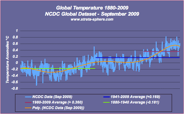
First off is a graph of the complete record from 1880 to August 2009. It is straight from the NCDC data set (processed results, not raw values – click to enlarge):
This is data from actual measurements from around the world – and it contains lots of geographic holes, data gaps and is of questionable precision. I have added some average temperature ranges for a few select time periods to show how little the data is actually moving. From 1880-1940 (first 60 years of the record) the NCDC considers the measurements to reflect a -0.181 °C ‘anomaly.  First off, we don’t have a clue if this is high or low – we don’t know what ‘normal’ is. Second, if anyone believes we can measure the world’s temperature to this precision before the computer age, they don’t understand math, engineering or science. We can’t measure that precision today, let alone from 1880-1940.
The second 68 years (from 1941-2009) the average temperature was +0.181 °C. This is not Earth shattering change (pun intended). And again, the precision we can define (let alone measure) a global temperature means these two numbers are as likely to be identical (or even reversed) than not.
The final range I have is from 1980-2009, the last three decades and comes out to a +0.38 °C ‘anomaly’.
Now this number happens to coincide with that time period from the 1st chart above showing a 0.5°F additional warming added on the raw data when processed by human conceived statistical models (yes, I know I am mixing data sets here). Is anyone going to be surprise that the 0.5 °F bias added to the raw NOAA data is equal to 0.28 °C? If I remove this bias from the NCDC 1980-2009 average I get +0.1 °C anomaly for the period. Another coincidence?
It think not.
Now if you look at the orange trend line you see a cyclic pattern that has a recent high point (which one  can reasonably believe might be a fictional artifact in the processing of the raw measurements). Remove that bias and the cyclic pattern goes flat (and would therefore have nothing to do with the linearly rising CO2 levels in the atmosphere). But that is not the only point. No one has proven these numbers are valid measurements of the Earth’s temperature.
I do enough math for space systems to know when numbers are a mirage of phantom precision. Let me pass a few other data points by you good folks to drive home the fact we have no way of knowing a single global temperature (averaged over a month from set of questionable sources).
In Antarctica the ‘normal’ temperature ranges are varied based on the section of this Europe sized continent you look at. Typical numbers are -12°C to -35°C monthly averages on the low plateau to -20°C to -60°C on the high plateau. Does anyone think we can define an average temperature for this part of the Earth to a tenth of a degree? Does anyone think we can measure an average temperature for this part of the world each month to a tenth of a degree? Does anyone believe we have this precision going back to 1880?
The Arctic is about the same, with temps ranging from -50 to +30 °C over the year. How about the Sahara Desert? 0 °C (freezing) to 54 °C (130 °F). Each region of the planet has different ranges of temperature and climate. You cannot create a single number that reflects all this diversity and claim it is the global temperature. It is naive to the nth degree.
BTW, I found this interesting tidbit about the Sahara Desert, which coincides with the fictional global warming trend:
Recent signals indicate that the Sahara and surrounding regions are greening due to increased rainfall. Satellites show extensive regreening of the Sahel between 1982 and 2002, and in both Eastern and Western Sahara a more than 20 year long trend of increased grazing areas and flourishing trees and shrubs has been observed by climate scientist Stefan Kröpelin.
Wow! Whatever is happening in the last 50 years, it is not creating more desert! I think we could use more of that.
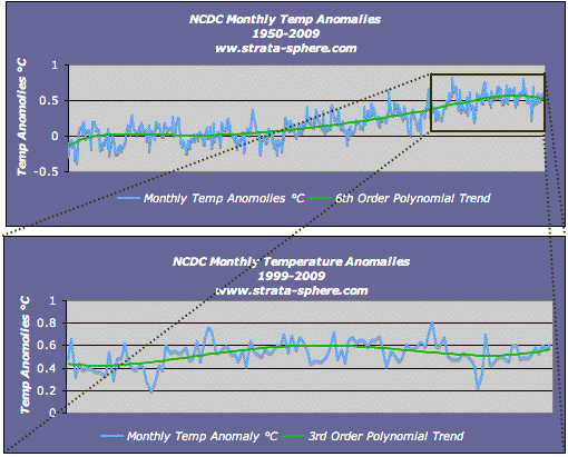
While Al Gore, boy genius, goes running around doing his Chicken Little dance (and all his IPCC hens cluck him on), the fact is there has been no significant warming in the last 50 years. Let me illustrate that by zooming in on that NCDC data I showed up above:
The upper pane of the graph (click to enlarge) shows the last 59 years, and it shows a questionable 0.5 °C rise in ‘global temperature’, and which is at a precision impossible to measure even for one month, let alone since 1950. If you removed the possibly phantom ‘post processed’ warming from the data that graph would be nearly flat.
The blow up in the lower pane shows the last ten years, and it is clearly not doing anything but bouncing up and down +/- 0.1 °C around an average level of +0.5 °C. Again, is the 0.5 °C is artificially high due to processing artifacts and not actually anything real? Regardless, the last decade as seen no warming while CO2 levels continue to rise.
To summarize: real scientists have discovered that the mythological global warming is actually an artifact of selected, unrepresentative data in many cases. Even NOAA admits to a processing bias added to raw measurements which coincides with this fictional warming. And if we look across the NCDC temperature record we see arrogant people claiming they can reduce the dynamic and varied regions of this huge planet down to a single number with a naive and unrealistic level of precision.
Global warming is man-made. It is a man-made fiction.


Have you ever read CO2: The Greatest Scientific Scandal of Our Time written by Dr. Zbigniew Jaworowski? It is good reading on the politics as well as the false data manipulated to fit a political agenda.
Here is the link
http://www.warwickhughes.com/icecore/zjmar07.pdf
SBD
Good post and good summary. Since this is something that should be quoted and referenced on other sites, you may want to fix the accidental misspelling of “Sahara” in the two links you’ve provided.
Thanks WWS – tried to rush it out before dinner. Must have Palin on the brain or something!
AJStrata