Feb 26 2010
The Walls Of Anthropogenic Warming Come Crashing Down
Addendum: Folks, I had to rush this out this morning so I could make a meeting. With a few minutes available I am editing and expanding this a bit, adding links, etc  – end addendum
The science of AGW (man-made global warming) is not only unsettled, it is systematically being debunked by more careful and rigorous application of statistics and math to the challenges of modeling the Earth’s climate. The foundation of this modeling is representing the period between 1880 and the present, where there is some pool of measurements around the globe. A pool that was sparse with huge uncertainties in the past (thus providing for errors and focus on measuring temps inside human enclaves) and which grew in scope, and then 20-30 years ago the number of actual measurements suddenly dropped off. This foundation is required as the point of departure for all longer term assessments, and must be right before we can make assumptions to temperatures prior to this period of record.
When graphing some data from a preeminent skeptic (E.M. Smith) I generated an interesting graph about global temperature indexes and number of stations:
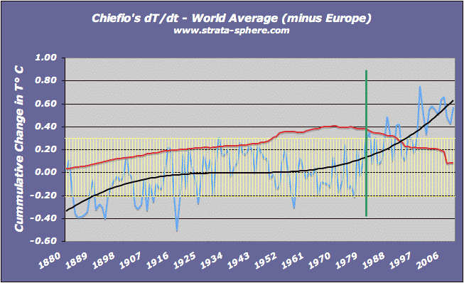
Note: Red is stations in thousands, yellow is 1 standard deviation (normal variance). Black is the trend and blue is the measurement of change since 1880. The green line notes when the number of station measurements started dropping off mysteriously.
I noted then that the data shows the distinct possibility that global temperature cooled as thermometers actually spread outside major cities, along with technology. Instead of just taking measurements in and around human enclaves, as a result of WWII and the Cold War we saw weather stations proliferate into rural urban areas across the globe. It seems pretty clear the expansion of measurements could honestly be a cause for some of the cooling seen in the last century, prior to the deletion of thousands of measurement sites from the estimates of the global temperature index.
A new study out adds another piece to this puzzling change in measurement points (which includes removing all measurements from the country of Bolivia 20 years ago, even though the data is still available). This study shows how ‘adjustments’ to raw data have actually spread the phenomena of Urban Heat Island effects out to sparsely populated regions. Here are the main graphs, first with the raw data showing urban and rural temperature trends across the US:

In this diagram the pink data is urban sensors where the Heat Island effect can clearly be seen as populations grew in density and radius. Blue is the rural ‘reference’  trend without large human enclaves. Note the warming trend in the 1930-1950 period, which is +0.4° C for both rural and urban sensors. In the current warm period the rural measurements are in the exact same range, but the urban measurements have grown 0.4°C – and in only in the last 30 years (when the number of measurements dropped away suspiciously). This is UHI.
The rural regions are only the regions where CO2 driven warming would clearly show up, outside the effects of forces from large population centers. This is very important and just not emphasized enough in the paper (scientist are very neutral in their wording, many times to neutral). If there was an impact on global warming coming from CO2 and Green House Gases (GHG), it would show up in rural locations and not be mixed or drowned out by UHI. Many AGW alarmists, Phil Jones of CRU specifically, have claimed there is no measurable UHI – but  this study clearly shows there is one hidden in the RAW data controlled by the NCDC.
The NCDC clearly ALTERS the raw data – and this ‘adjusted’ data is what is provided to other researchers. This ‘adjusted’ data is wrong as can be seen in the post-adjustment graph:

What we see is an alteration of the rural ‘reference’ data to match the UHI effected data! The claim is that this ‘adjustment’ does just the opposite. It is supposed to cool down measurements from large human enclaves and REMOVE the UHI effect. As anyone (even Al Gore!) can see this claim is 180° wrong. The rural data has been ‘adjusted’ (more like infected) with the  UHI effect.
In the second graph the 1930-1950 warm period has been cooled by 0.2°C and the current period has been warmed 0.6°C! This clearly is not how to remove UHI. You don’t warm the none UHI effected areas to match the UHI effected areas. Is this pathetically shoddy math or another trick to hide the decline? Only time and serious investigation will tell. Whatever the source of the problem is it is universal, as many have discovered independently around the world.
The paper just about destroys the AGW theory. It shows that the UHI effect indeed exists and is out there in the raw data. But moreover, it demonstrates that there cannot be any CO2 or GHG driven warming because it is not showing up in the rural sites, away from the UHI effects. Finally, it shows what a bunch of incompetent people have been involved in developing the AGW foundations. In an attempt to cool UHI effects they did just the opposite.
We now know the UHI effect ‘disappeared’ because someone erroneously spread the UHI data over the rural reference data – creating a false image of warming and covering up the evidence against CO2 or GHG warming. What really is a crime is that no one in the AGW camp thought to do this simple validation check between the raw and ‘adjusted’ data This error is simple, obvious and demonstrates lack of quality at best.


Is this pathetically shoddy math or another trick to hide the decline?
It’s probably ‘very clever’ math. I suspect the only way this fits any math equation is if you draw the graph the way you want it then write an equation to fit it.
This is good information and I thank you for devoting your time to making it very clear what those clowns are up to.
Thanks Redteam. Actually, this is such a basic mistake I do wonder how ‘clever’ it really is.
In my line of work I have learned that most mistakes are so basic people miss them (as when we drove a satellite into Mars because one group was using metric and the other english units).
To be honest, this looks like one of those cases. But given the AGW mess, I would not be surprised with it being a ploy to hide the truth.
[…] on record.  AJ Strata has serious number crunching up for further education today in his post, The Walls of Anthropogenic Global Warming Come Crashing Down. Possibly related posts: (automatically generated)I wanted the Ch-Ch-Ch-ChiaIt took a year for […]
AJStrata,
This piece is very good. The important thing now is to show in detail how the they have fiddled with the data and made up the warming. That they have cheated regarding the consequences of AGW is one thing but unimportant compared to their cheating regarding the basic data sets. So we have to show that the data sets are crap.
And then we very much need to show the mechanism/method of cheating and a number of cases where this method has been used. Now we – thanks to AJStrata and other fellows -start to understand how they did it. Please continue this very important work to save our civilization!
thanks SwedHumanRights
As two or three of us said on WUWT, although this looks very sinister indeed, in our view Dr Long needs to expand his paper to include a more representative set of stations to guard against accusations of cherrypicking.
If we can ever get to grips with the actual alterations, I accept it may not be necessary, but I suspect that some grubby algorithm will have been written to deliver the required “adjustments” without leaving pawmarks all over the record – “Look Ma no hands!”.
David S,
There is no cherry picking here. There is no excuse or rationale to warm the rural stations to adjust for UHI heating in urban sites. None!
And from all the other graphs I have seen of raw verses ‘adjusted’ done by skeptics over the last few months, with the same pattern of removing earlier warm periods and raising recent temps, what I see is a classic simple mistake that has gone undetected for years.
Like I said above – the fact two groups never realized they were using english vs metric units for 7 years while working Mars Obsserver. This not as uncommon as you might think. And if true, it will sink AGW.
Recall CRUs upside down sign problem with tree ring density?
Maybe they got a couple of Fahrenheits mixed in their Celsius…..
I didn’t say there was any cherry picking, I am simply looking to head the warmists off at the pass. I agree that it should not be possible to find one pair of sites that behaves like this, let alone 48, but this is such an opportunity to demolish a major plank of the AGW argument that it needs all possible detail and supporting analysis.
David S,
Sorry, my misunderstanding. There is no escape from this one.