Mar 31 2011
Regulating CO2 Is Based On A Lie, That Hides The Real Data, Which Disproves AGW
We are going to have a vote this week in the Senate on whether we should throw billions of dollars and millions of jobs down the toilet because of some Green-Eyed liberal fantasy about CO2 causing global warming. It is important for the American people to understand that pulling the EPA’s authority to control all energy and businesses through a mythological effort to save the planet is actually going to save the planet – from power hungry fools.
The entire argument for regulating CO2 is based on a series of falsehoods, which when exposed make the argument for WHY the EPA needs to be reigned in.
First we have data which disproves the now defunct theory of Anthropogenic (Human Driven) Global Warming – AGW. If one looks over the past half century one would expect to find that, as a result of the clearly measured increase in atmospheric CO2, the Global Temperature is warming. The CO2 levels have increased (yet are nowhere near historic highs). But folks would be shocked to discover there has been NO response in temperature AS THE THEORY DEMANDS if the theory were actually true:
The whole idea that carbon dioxide is the main cause of the recent global warming is based on a guess that was proved false by empirical evidence during the 1990s. …
Let’s be perfectly clear. Carbon dioxide is a greenhouse gas, and other things being equal, the more carbon dioxide in the air, the warmer the planet. Every bit of carbon dioxide that we emit warms the planet. But the issue is not whether carbon dioxide warms the planet, but how much. …
The planet reacts to that extra carbon dioxide, which changes everything. Most critically, the extra warmth causes more water to evaporate from the oceans. But does the water hang around and increase the height of moist air in the atmosphere, or does it simply create more clouds and rain? Back in 1980, when the carbon dioxide theory started, no one knew. The alarmists guessed that it would increase the height of moist air around the planet, which would warm the planet even further, because the moist air is also a greenhouse gas.
This is the core idea of every official climate model: for each bit of warming due to carbon dioxide, they claim it ends up causing three bits of warming due to the extra moist air. The climate models amplify the carbon dioxide warming by a factor of three – so two thirds of their projected warming is due to extra moist air (and other factors), only one third is due to extra carbon dioxide.
I’ll bet you didn’t know that.
…
The climate models all predict that as the planet warms, a hot-spot of moist air will develop over the tropics about 10km up, as the layer of moist air expands upwards into the cool dry air above. During the warming of the late 1970s, 80s, and 90s, the weather balloons found no hot-spot. None at all. Not even a small one. This evidence proves that the climate models are fundamentally flawed, that they greatly overestimate the temperature increases due to carbon dioxide.
… You see, in science empirical evidence always trumps theory, no matter how much you are in love with the theory. If theory and evidence disagree, real scientists scrap the theory. But official climate science ignored the crucial weather balloon evidence, and other subsequent evidence that backs it up, and instead clung to their carbon dioxide theory — that just happens to keep them in well-paying jobs with lavish research grants, and gives great political power to their government masters.
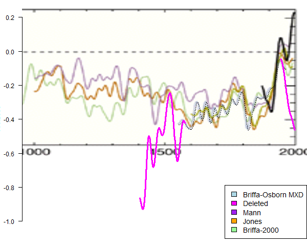
So, how did they hide this real data? Well, there are a series of now infamous graphs and studies which actaully ‘hid’ the long term temperature data which supported the weather balloon results. Worse yet, the bad data was summarily tossed out of calculations and replaced by manipulated thermometer data – pretending these were all one consistent set of data. Which they were not. Here is one of the newly discovered smoking guns:

This smoking gun was discovered by the dogged statistical expert Steve McIntyre. [click to enlarge]. What the graph shows (in plain English) is how the purple data set was deleted from the equations (and graph) and replaced with the thick black data at the end of the series – which gave this chart and all its later version the Hockey Stick shape. Without that black blade sticking up in the air, there is no global climate emergency.
See, all the ‘temperature’ data that is shoved around under the noses of pliant politicians and journalists (most of which struggled through grade school math and science) is actually not temperature data. It is a guesstimate of local temperatures based on what are called proxies. These can be measurements of atmospheric chemical and elements in ice cores (which tend to disprove the idea CO2 drives global temperatures). But in these graphs they are mostly related to organisms, through which any local temperature ‘signal’ is noisy – which means it has a lot of error bars on it.
In fact, the deleted and hidden purple data indicates how noisy these proxies really are (in this case tree rings at high elevations and latitudes). Notice how the purple line ‘diverges’ from the other data between 1400 and 1700. That shows that the tree ring data is barely (if at all) able to reflect local temperatures. It only matches for a brief time before wandering its own way then and in recent times. This was the latest smoking gun uncovered on the AGW pile of misinformation.
When this data was hidden, it hid the fact we cannot compare modern temperature records to any historic recreation using these attempts with any accuracy. In fact, the more recent part of the purple line, which dives down while the so called modern temperature record rises to unseen heights is unambiguous evidence of just this. If proxies where a good measure of temp, they would follow modern temperature which are actual (if not spare) measurements. Clearly they don’t.
So why would someone hide this important key fact? Why would someone delete good data and replace it with an illusion? Probably all that money and those careers built upon being the top Chicken Littles on the planet.
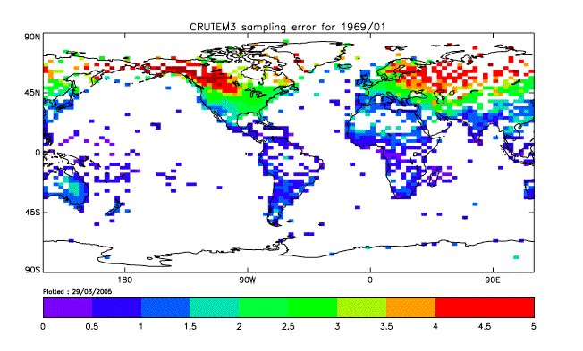
Another bit of data rarely shown is the estimates of error from the UK’s Climactic Research Unit (CRU) itself – home of the AGW theory and cover up. Here is a graph of the 1961 calculated (not estimated) error in the temperature records that make up the 1961 Global Temperature index:
It comes from this CRU document. This analysis indicates that the temperatures for each grid (square) that make up the record for 1961 are only accurate to 1-3° C. If 1961 is only accurate to this level, all the other years are as well. Which means you cannot use this data to claim a sub-degree change over time. That is well into the noise of the data. This is what CRU does not advertise, because it blows away the Hockey Stick chart and replaces it with a tube of large unknowns with an error band of +/- 3° C or more.
Which brings us to the lie. It was not enough to just trim data in a graph to fit their defunct theory, it was cooked math as well. And to this day the liars still pretend no one caught them in the act. When the world’s real scientists, engineers and mathematicians focused their attention on the AGW alarmists arguments, they discovered dodgy math, unfounded and hyped claims, deleted data that disproves their theories, a biased and manipulated peer review process and a lot of propaganda thrown on top.
Which is why the EPA’s efforts to regulate the air you breath out is such a farce and must be stopped. We may witness this week an act in Congress that actually stops a disastrous power grab from coming to fruition. At least let’s hope so.


It’s not about the data anymore – the Data doesn’t Matta. That went out of fashion as soon as it began to turn against the AGW theories. That’s why no “climate scientist” dares to use the highly accurate satellite data over the manipulated and stretched too thin ground data stations.
This is nakedly a play for power over a new revenue stream – and all they have to do is to get everyone to believe in a lie to do it.
Funny to watch their entire game fall apart. All the wheels are coming off of the train.
25 feet of snow reported at Donner pass.
This proves without a shadow of doubt Global Warming is true and we need to to be taxed to death to prevent this from ever happening again!
We gotta do somethin’ about AGW soon – GE and Al Gore’s investments depend on it.
“25 feet of snow reported at Donner Pass.”
I sure hope there aren’t any wagon trains comin’ through!