Apr 24 2009
BBC Misinforms On Solar Activity And Its Effect On Global Climate
In a recent report on the mysterious quieting of the Sun over the last few years the BBC used a theoretical  100 year trend to falsely give the impression there has been no global cooling since a recently detected reduction in solar activity began a short year or two ago:
The Sun is the dimmest it has been for nearly a century.
…
The Sun normally undergoes an 11-year cycle of activity. At its peak, it has a tumultuous boiling atmosphere that spits out flares and planet-sized chunks of super-hot gas. This is followed by a calmer period.
Last year, it was expected that it would have been hotting up after a quiet spell. But instead it hit a 50-year low in solar wind pressure, a 55-year low in radio emissions, and a 100-year low in sunspot activity.
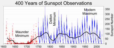
So far so good. We have not seen this long a period of low solar activity in 50-100 years, which is not the same thing as saying the Sun has been this low in activity for that  period – far from it. Here is a chart showing 400 years of sunspot activity as recorded over the centuries by scientists:
Note how the activity rises and falls. Since 1900, the solar activity has been rising until very recently. Keep this in mind as we dissect the rest of article’s claims.
The article also correctly notes how these solar minimums line up with extreme cool phases in our history (just as higher solar activity lines up with warmer periods such as those experienced during Medieval Times and the height of the Roman Empire).
In the mid-17th Century, a quiet spell – known as the Maunder Minimum – lasted 70 years, and led to a “mini ice age”.
…
Professor Lockwood believes that as well as the Sun’s 11-year cycle, there is an underlying solar oscillation lasting hundreds of years.
He suggests that 1985 marked the “grand maximum” in this long-term cycle and the Maunder Minimum marked its low point.
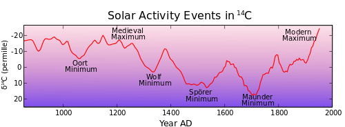
Actually, for those interested they should review the Maunder Minimum (1645-1715), The Dalton Minimum (1790-1830) and the Spörer Minimum (1420-1570). In fact, there are multiple minimums that have been detected in various scientific reports looking at various proxies such as tree rings, ice cores, etc. The following chart (click to enlarge) shows a regular pattern of waxing and waning solar activity, which trends very well with global temperatures.
Note how the solar activity trends right along with global temperatures that have been rising since the Little Ic Age of the Maunder Minimum. Â CO2 levels don’t have anywhere near this level of correlation with global temperatures. But I digress.
Where the BBC becomes a purveyor of falsehood is in its attempt to dismiss this change in solar activity by hinting it has no driving effect on our global temperature:
Prof Lockwood was one of the first researchers to show that the Sun’s activity has been gradually decreasing since 1985, yet overall global temperatures have continued to rise.
…
“If the Sun’s dimming were to have a cooling effect, we’d have seen it by now.”
…
Data from the Intergovernmental Panel on Climate Change (IPCC) shows global average temperatures have risen by about 0.7C since the beginning of the 20th Century.
And the IPCC projects that the world will continue to warm, with temperatures expected to rise between 1.8C and 4C by the end of the century.
Prof Lockwood is wrong on two counts. There as not been a significant reduction in solar activity since 1985. And there has been a recent cooling as the solar activity dropped off to historic lows in the last year or so.
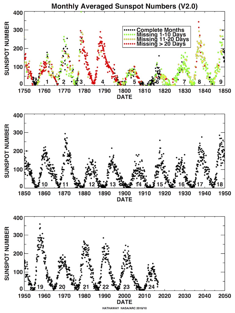
Notice how we shifted from a phenomena only a couple of years old into trends spanning centuries? Why mix apples and oranges like that? The truth is we have seen a cooling trend, especially since the last solar maximum. We would NOT be seeing a cooling trend until the solar activity fell to a point where there was a net loss of energy over a long period of time. If we look at the solar activity for the last 20 years we see the peak may have been 1985, but activity was very flat until just recently. Check out the last pane of the following chart (click to enlarge) and you will see no significant downward trend in solar activity from 1985 to 2005, nor across the last three solar cycles (33 years):
Whoever this “Professor” is he does really shoddy science. His ‘hypothesis’ is already wrong since to detect a lowering of temperature after his ‘theoretical peak ‘in 1985 there first had to be some lowering of solar activity since 1985 – which is only now occurring. The lower activity did not occur after 1985 through 2005.
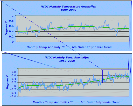
The other falsehood posited by the BBC/IPCC is the idea that a 0.7 °C rise in temperature over the last 100 years has any bearing on the very recent change in solar activity. The slowing solar activity this century (the last ten years lets say) has shown not only an end to warming, but the beginning of cooling. The following chart (click to enlarge) shows the NCDS monthly global ‘anomalies’ for the period 1950-2009 on the bottom, with a blow up of the period 1999-2009.
What the data shows is that through the normal sun cycles the temperature rose from 0.4 °C to 0.6 °C, or 0.2 °C (which is well into the margin of error for any global temperature estimate). But since the lowered solar activity as shown up the average anomaly as dropped by 1 °C (which is also in the noise). Therefore there has been a drop in global temperature in accordance with the reduced solar activity!
Even looking long term from the 1950 era to now, the Global Temperature has only moved a glacial 0.5 °C, still within the margin of error and right in line with solar activity increasing from 1900-2000. Conversely, since the solar activity started dropping the global temperature started dropping, As the solar activity rose since the Dalton and Maunder Minimums leading to the Maunder Maximum, global temperatures rose. CO2 levels are not a driver. A Carbon Cap and Tax scheme will not effect global climate. The data doesn’t lie.
Addendum: Democrat Congress John Dingell admits “Cap & Trade is a tax, and its a great big one” (time mark 4o or so). Dingell is asking the Gorical which is better a Carbon Tax or Cap & Trade (the hidden tax). Gore’s answer: he wants both!
As I noted above, it won’t do a damn thing but make some democrat cronies filthy rich and the average person a hell of a lot poorer.



AJ, according to Dr. Leif Svalgaard’s data that is updated regularly we should begin to see spots soon. The pink line in the graph is the radio flux which seemed to have bottomed out in late 2008 and is now starting to ramp up, though we aren’t seeing any spots yet.
Leif has hypothesized that we are going to see cycles much like the ones we saw in the early 19th century, in other words … weaker cycles than we have had recently.
The blue line is interesting. That is the TSI or total solar index which has been pretty much flat.
Hey, did you hear about Lord Monckton getting “disinvited” to appear before Congress today with Al Gore? Seems they didn’t want to embarrass Al.
AJ
You have mail with an interesting new chart to look at.
Soros just invested in a carbon sequestration start up...nothing to see here……………….