Jan 02 2010
Man-Made Global Warming Was Biggest Con Of The Last Century
One thing 2009 will be remembered for is it will be the year the man-made global warming con finally fell apart. It will be partially due to the shoddy ‘science’ used (and abused) to promote the con. It will be partially due to the realization that the con was being run by people with financial ties to green corporations who were trying to control the entire energy segment of the world. Bernie Maddoff was an amateur in comparison. It will also be due in part to the illuminating emails and data made public in what is called Climategate.
But all of these factors are really only making headway because of the main underlying factor destroying the myth of man-made global warming: the raw data.
The premise behind man-made global warming is this:
- CO2 is a green house gas – which magically and whiteout a scientific proof over powers all other climate and temperature factors, like that huge nuclear furnace at the center of our solar system and water vapor which makes up 90-95% of the green houses gases.
- Since industrialization and the population explosion, humankind as been pumping vast amounts of CO2 into the air – over powering sources of CO2 like volcanoes, animal by products, etc.
- The result has been out of control, never before seen, global warming.
This last part is not true of course, since the 1930’s and 1940’s were just as warm as the 2000’s, most of the Earth’s heat records are from the 1930’s, the warmest year on record is from the 1930’s, and the MWP was as warm or warmer than today.
While most skeptics (we heretics of the Church of Al Gore/IPCC) have been able to destroy the 3rd leg of this ‘theory’ (or is that theology?), the fact is data is out now destroying the first two assumptions as well.
A recent scientific report notes that there has been – wait for it – no significant increase in CO2 levels over the last 160 years:
Most of the carbon dioxide emitted by human activity does not remain in the atmosphere, but is instead absorbed by the oceans and terrestrial ecosystems. In fact, only about 45 percent of emitted carbon dioxide stays in the atmosphere.
…
To assess whether the airborne fraction is indeed increasing, Wolfgang Knorr of the Department of Earth Sciences at the University of Bristol reanalyzed available atmospheric carbon dioxide and emissions data since 1850 and considers the uncertainties in the data.
In contradiction to some recent studies, he finds that the airborne fraction of carbon dioxide has not increased either during the past 150 years or during the most recent five decades.
This is not the only data showing this to be true. Ice cores are wonderful records of the atmosphere, and are found all over the world. It is interesting to see this data then, which shows CO2 levels were higher in the early 1800’s than right now:
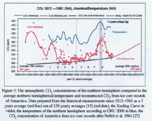
This is a lot of data on one graph, so let me direct your eyes to the key points. Basically follow the red dots, which are the yearly average CO2 levels in the atmosphere as measured in ice cores (what the graph calls ‘CO2 chemical’). As anyone can see the early 1800’s had years with higher CO2 levels than today, which began dropping as the industrial revolution took off. Strange? If you follow the red line (a 5 year average of the dots) we see the CO2 levels don’t really take off until the 1940’s – as global temperatures are already rising.
In fact, the CO2 is clearly lagging the temps, not leading it as it would if it was a driving factor.
We see this again in the ice core record going back thousands of years (as I noted in this post). Over time the atmospheric CO2 response has typically lagged temperature increases, sometimes by as much as 800 years! Clearly this contradicts assumptions 1 and 2 in the theory of man-made global warming.
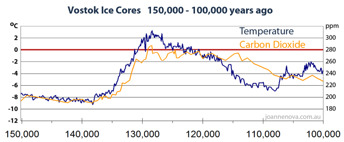
This lag time is conveniently covered up by the high priests of AGW by compressing the time scale of these ice core graphs to make it appear as if the CO2 and temperature are completely in sync (refer to the linked post). The fact is the more truly global data we get, the more man-made global warming disappears in a poof of accuracy.
WUWT ran an interesting graphical comparison between IPCC/GISS global estimates and highly accurate satellite data which really illustrates this. The IPCC/GISS data are ‘estimates’ because the data set shown is really derived from sparse measurements made by temperature stations of dubious precision spread across the globe. To create a world map they estimate what the data in the holes will look like, basically making up 99% of the data (trust me, much less than 1% of the Earth’s surface is directly measured by sensors). Here is that guesstimated graph from WUWT:

As I said, 99+ % of that graph is estimated based on unproven and unverified extrapolations and ‘corrections’ which the AGW high priests use to create the impression of run away warming. Look at all the red areas and so little blue. White is neutral and seems to be the minority.
The satellite data, while not as long a record, is incredibly accurate and detailed. You have one type of sensor taking the same measurement thousands of times over the Earth each day. There is no guesstimating holes here. And of course that picture for the last 10 years shows a completely different story:

Now look at the amount of red versus white versus blue, and the intensity of the red and blue. The blue dominates, with white coming in second. Antartica (which is a continent estimated using something ridiculous like 10 ground stations) looks dark red in the upper chart, but is a mild pink in the satellite record. Sort of explains why the Antarctic sea ice extent has been growing over the last 3 decades instead of shrinking – as the dark red bands would imply.
Look at how much white and blue exists verses red. The satellite data clearly shows a cooling planet over the last decade. Also marvel at the detailed measurements. The coverage of the satellite data is 100% over land in this case. If you add in those satellites that derive Sea Surface Temperatures I would wager it would look very similar – more cooling than warming.
The top graph reminds me of a paint by numbers picture, crude and imprecise. The 2nd one illustrates real modern science. It also proves the biggest con of the last century was man made global warming.
Just as this latest reversal from the UK Met office illustrates:
Britain is bracing itself for one of the coldest winters for a century with temperatures hitting minus 16 degrees Celsius, forecasters have warned.
…
“The cold weather comes despite the Met Office’s long range forecast, published, in October, of a mild winter. That followed it’s earlier inaccurate prediction of a “barbecue summerâ€, which then saw heavy rainfall and the wettest July for almost 100 years.â€
Yep – coldest winter in a century. Therefore  CO2 cannot over power all those other climate factors as claimed.
BTW once the cold snap breaks we shall see another nail in the coffin of CO2, because NASA satellites are poised to disprove a critical segment in the CO2 driven warming theories:
New measurements from a NASA satellite show a dramatic cooling in the upper atmosphere that correlates with the declining phase of the current solar cycle.
…
The TIMED measurements show a decrease in the amount of ultraviolet radiation emitted by the Sun. In addition, the amount of infrared radiation emitted from the upper atmosphere by nitric oxide molecules has decreased by nearly a factor of 10 since early 2002. These observations imply that the upper atmosphere has cooled substantially since then. The research team expects the atmosphere to heat up again as solar activity starts to pick up in the next year.
…
The SABER dataset is the first global, long-term, and continuous record of the Nitric oxide (NO) and Carbon dioxide (CO2) emissions from the thermosphere.
…
“A fundamental prediction of climate change theory is that upper atmosphere will cool in response to greenhouse gases in the troposphere,” says Mlynczak. “Scientists need to validate that theory. This climate record of the upper atmosphere is our first chance to have the other side of the equation.”
Recall the theory here. CO2 acts as a shield, holding heat in which cannot reach the troposphere and radiate out to space. It means we better not see the troposphere warming when the next solar cycle kicks in (and it is already beginning to rumble back to life). If increased solar activity results in increased tropospheric radiation, that will spell the end of the CO2 driven climate argument. It is a bust if that happens.
And we should see that result showing up this summer – just in time for the 2010 elections. History can be so ironic in its timing.
BTW, stop by and read this excellent summary at Powerline.


But let’s pay proper homage to “Y2K” and ISO-9000.
[…] This post was mentioned on Twitter by Suhr Mesa, AJ Strata. AJ Strata said: new: Man-Made Global Warming Was Biggest Con Of The Last Century http://strata-sphere.com/blog/index.php/archives/12118 […]
Thanks for these reports, graphs and easy to understand explanations/analysis because I find so much of this complicated. I notice a large concentration of red in what appears to be Canada. Wonder why that area stands out so much? It’s hard to find rhyme or reason in understanding some of these charts.
[…] link: The Strata-Sphere » Man-Made Global Warming Was Biggest Con Of The Last Century […]