Dec 06 2009
Pre “Adjusted” CRU Data & IPCC AGW Models Prove AGW Theory Is WRONG!
[Note: all graphics can be clicked to enlarge]
Whoever dumped the CRU data was very knowledgeable of the data at CRU and took a great deal of time to select only files with important nuggets of insight. It took significant time to collate this treasure trove of truth.
One of the most interesting CRU files for me is the idl_cruts3_2005_vs_2008b file, which compares the global station temp data for from two different versions of the CRU station temps. It is interesting because this data is clearly generated before all the alarmist fudge factors and rescaling are applied and turn these undulating, but fairly flat temperature profiles (spanning 100+ years) into ramps of runaway warming.
I had the chance to test this theory recently in another post. Using raw temperature data from the Nordic regions of Europe I overlaid one of the CRU graphs from the 2005_2008b file (from Norway) and I got a very good  match:
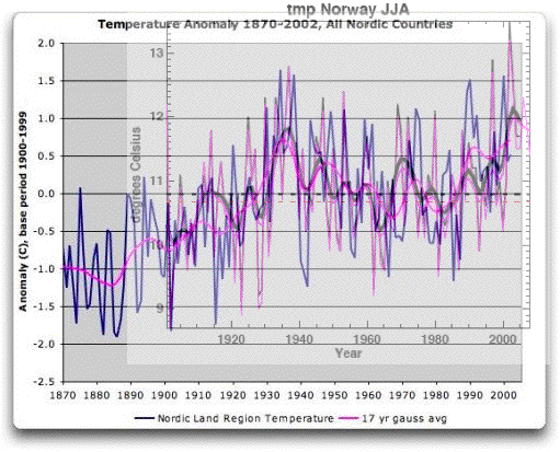
This gives me extremely high confidence that the 2005_2008b file is truly the CRU land temp data before they do all their speculative and unproven ‘data processing’.
When I did this experiment there were other IPCC graphs used in the post that came from this WUWT article. What caught my eye (and apparently my brain has been background processing for nearly a week) was this graph showing AGW model predictions compared to land temp “observations” – note this term because it is very, very important.

Let me blow up the South America region to explain some details and set the stage for what is a stunning result of climategate.

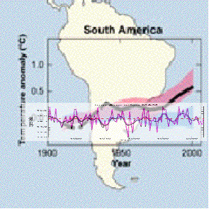
The reddish band is the AGW model predictions where CO2 feedback is driving Earth’s climate over the last 100 years. Because this reddish band follows the black ‘observations’ line the conclusion would be that the theory of AGW has been supported in the temperature record. The blue band shows what the models PREDICTED the global temperatures would be without AGW. Climategate has really done a number on that black line folks.
The CRU raw station data I have been looking over does not follow the black ‘observation’ lines, at all. Those researchers tuning their AGW models to the CRU post ‘adjusted’ data have been chasing a ghost.
The CRU raw temp data actually follows the blue band, where the models say the temps will fall if AGW does not exist. For example, here is the CRU country data for all four seasons in Bolivia, South America:
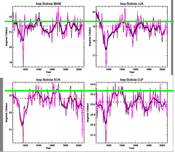
Anyone can see those trend lines appear to follow the blue band in the AGW model predictions, there is no hockey stick in them. I added the green lines to show how the current temperatures in South America are actually significantly cooler than the 1940’s ‘blip’. Here is another example from Argentina:
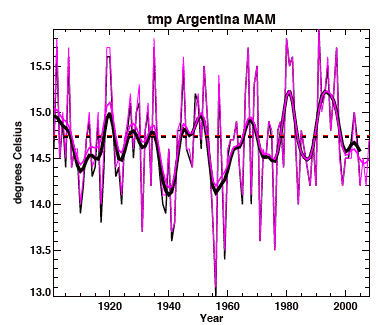
This is March-April-May for Argentina. It is fairly representative of South America has a whole. Now what happens if I overlay this CRU pre ‘adjustment’ historical temp data on top of the IPCC AGW model predictions – what will this data show?
No big surprise for me – it shows the CRU station data, unbiased by alarmists, follows the AGW models without CO2 forcing. Now this is a crude comparison since I cannot exactly line up scales, etc. So I can further confirm this by comparing the pre-1960’s peak temp, shown in the IPCC model runs, to the 2000’s peak temp and see if I am getting the hockey stick.
Here is how I did this for all the CRU raw station data previously. For each seasonal graph I identified the 2005 (black) trend line peak prior 1960 and the peak temp in the 2000’s and computed (by eyeball) the difference.
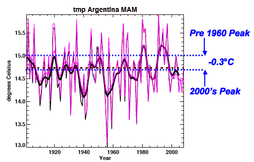
In this case, Argentina MAM for the 2000’s period is  -.3°C below the pre-1960’s peak. I know this misses the 1990’s peak, but we are comparing models to reality, and the reality is it has been cooling since the 1990’s peak. Especially if you follow the purple line, which is the 2008 trend. It shows an even larger drop off.
The IPCC models clearly indicate that if AGW was true, the pre 1960’s peak would be a good 0.3°C below current temps. What I discovered in my analysis was just the opposite. Here is a blow up of my detailed results for South America (peak-to-peak comparison).
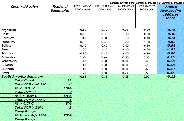
On average South America shows a -.11°C drop from before the 1960’s to the 2000’s. The season of September-November-October (their summer) shows average temp is now -.25°C below the pre 1960’s peak! Moreover, most of the countries have not seen any warming outside the +/- band of 0.5°C (in my judgement the accuracy limit of CRU’s data). For those 5 countries which showed temp changes greater than 0.5°C, 4 of them were cooler, not warmer.
Conclusion from CRU data: It has been cooling in South America, not rising as the AGW models predicted for man made global warming driven by CO2.
Therefore, if we accept the AGW models as representing proof or disproof of AGW, then the models show CO2 forcing cannot be what is driving the Earth’s climate.
I can see how those in the rapture of AGW zealotry could read those graphs and come away feeling their world view was being supported. I have seen people lose their objectivity many times. I do not know if all the data manipulation by Jones, Mann, Schmidt and others was driven by blind ideology or a crass act of misinformation. It doesn’t really matter – what the CRU data shows before being ‘adjusted’ (which muddies it and makes it useless for the AGW model predicts) is there cannot be CO2 driven AGW. The models needed to be verified against the raw temp data to be proven, not against data processed to mimic the AGW preferred result.
QED: Climategate proves there is no AGW. No wonder CRU hid the data and the decline.


[…] Ongoing story and the press is still barely being mentioned in the press. Not for a lack of interesting angles. The press just won’t allow the narrative to be tampered […]
AJ –
I found this at Hillbuzz.org. It concerns AlGore taking over the LANDSAT project when he was “reinventing government”. Do you see anything here that smacks of early AGW efforts? Here is the link: http://hillbuzz.org/2009/12/03/connect-al-gore-to-nasa-landsat-and-loral-aerospace/
[…] The climate research brouhaha has emphasized the roles of amateurs in science. M&M (the Canadian retiree and his partner the economics professor) who raised a lot of ire in the revealed communications are the famous ones. Two more examples can be seen at the Coyote Blog in Example of Climate Work That Needs to be Checked and Replicated and The Strata-Sphere at Pre “Adjusted†CRU Data & IPCC AGW Models Prove AGW Theory Is WRONG!. […]
Dutch: Gore Wrong on Snows of Kilimanjaro
http://pajamasmedia.com/blog/dutch-gore-wrong-on-snows-of-kilimanjaro/
jforrik – sorry man, there is nothing there. Al Gore never had anything to do with real scientific progress, and had nothing to do with Landsat. And Loral is not shady either.
South America is also an interesting case as it is one of the places where hundreds of recording stations have “disappeared” from the GHCN network over the past couple of decades.
The stations haven’t actually “disappeared”, they are still there recording data but they are no longer included in the network and so are no longer included in global climate data. Most of the missing stations are rural and would be the ones most likely to show no climate change.
[…] up with that, and the Strata-sphere, examine these predictions and retrodictions in the light of what we now know about regional […]
AJ,
Pulled the average monthly temperatures from NOAA for Ohio and the nation from 1898 to 2009 and guess what, a big flat line!
The hockey stick is supposed to begin in 1900, yet the monthly average temperatures show no uptick over the last 111 years.
In fact, the only temperature anomaly that shows in the graphs from NOAA comes from 1978 blizzard.
If you’d like to take a look: http://thevirtuousrepublic.com/?p=4785
Links to the NOAA data are at the above link as well.
Thanks for jumping into the data.
Sincerely,
Bryan
Haven’t you figured it out yet??? The “emails” are innocuous. And that’s all there is to it! (sarcasm/off). There is no data. There is no data. There is no data, There is no data.
[…] This post was Twitted by BlackMagic63 […]
[…] I noted this very trend myself in South America using CRU pre ‘adjusted’ data made public in the recent data dump. The CRU pre ‘adjusted’ data followed the blue region, thereby proving via the AGW models there is no man-made global warming. And we saw this before in another analysis from New Zealand (here and here). […]
[…] I saw the same thing in South America – seems this is breaking out all over the globe. […]
[…] This post was Twitted by AJStrata […]
[…] Pre “Adjusted†CRU Data & IPCC AGW Models Prove AGW Theory Is WRONG! […]