Nov 29 2009
CRU Raw Temp Data Shows No Significant Warming Over Most Of The World
Bottom Line – Using two back-of-the-envelope tests for significance against the CRU global temperature data I have discovered:
- 75% of the globe has not seen significant peak warming or cooling changes between the period prior to 1960 and the 2000’s (significance being a rise above 0.5°C threshold, which is well within the CRU’s own stated measurement uncertainties of +/- 1°C or greater for any one year.
- Assuming a peak to peak change (pre-1960 vs 2000’s) should represent a change greater than 20% of the measured temperature range (i.e., if the measured temp range is 10° then a peak-to-peak change of greater than 2° would be considered ‘significant’) 87% the Earth has not experienced significant temperature changes between the pre-1960 period and the 2000’s.
So how did I come to this conclusion? If you have the time you can find out by reading below the fold.
I have been working on this post for about a week now, testing a hypothesis I have regarding the raw temp data vs the overly processed CRU, GISS, NCDC, IPCC results (the processed data shows dramatic global warming in the last century). I have been of the opinion the raw temp data tells a different, cooler story than the processed data. My theory is that alarmists’ results do not track well with the raw data, and require the merging of unproven and extremely inaccurate proxy data to open the error bars and move the trend lines to produce the desired result. We have a clear isolated example from New Zealand where cherry picked data and cherry picked time windows have resulted in ‘data merging’ that completely obliterates the raw data.
To pull this deception off on a global scale, as I have mentioned before, requires the alarmists to conceal two inconvenient truths:
- The warm periods in the 1930’s and 1940’s which were about the same as today
- The current decline in temperature, just when the alarmists require a dramatic increase to match rising CO2 levels.
What is needed out the back end of this alarmist process is a graph like we have from NCDC, where the 1930’s-1940’s warm periods are pushed colder and the current temps are pushed higher.

People have found actual CRU code that does this, and it does it by smearing good temp data with inaccurate proxy data (in this case the tree rings) or hard coded adjustments. The second method used by alarmists is to just drop those inconvenient current temps showing global cooling, which has also been clearly discovered in the CRU data dump.
I have been attempting to compensate for the lack of raw temperature data values by using country-by-country temperature graphs dumped with data from University of East Anlgia’s Climate Research Unit (CRU). The file is named idl_cruts3_2005_vs_2008b.pdf, which tells me this is the latest version of the CRU raw temp data run in prep for a new release of the data (the PDF file was created in July 2009).
I am confident this data is prior to heavy handed corrections employed by CRU and its cohorts. The fact is you can see a lot of interesting and telling detail in the graphs. Much of the Pacific Ocean data has been flipped since 2005 trying to correct prior errors and you can see the 2008 data trend way downward in most of the graphs. In addition, the 1930’s-1940’s warm periods have not been squelched yet. The alarmists have not had a chance to ‘clean up’ this data for the general public (which is one reason I think this file was in the dump from the whisteblower).
Before we get to actual examples and my detailed (and way too lengthy) analysis, I need to explain the graphs and how I used them (click to enlarge).
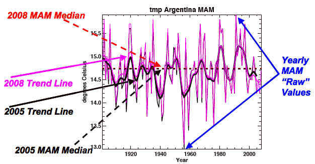
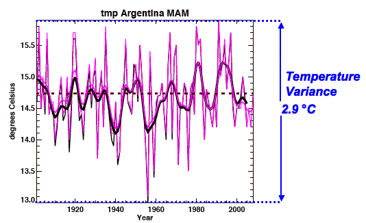
In this graph we see the primary data we have available from CRU. This is a comparison of the 2005 runs in black and 2008 runs in light purple/red. At CRU all the data is blocked into quarters. This graph is MAM, which stand for March-April-May, for Argentina. Each country has four graphs for the four quarters of the year (June-July-August (JJA), September-October-November (SON) and December-January-February (DJF).
The ‘raw’ quarterly data is noted with the blue arrows. It is the highly variable lines from which the (much less accurate) trend lines are generated. First note the smoothed values represent a fraction of the full temperature range (the y-axis range, in this case almost 3°C).
I point this out to note that fact that to create a quarterly value for a given country for any given year means the raw daily temp data has already disappeared under a mountain of averaging. Day/Night temps must be combined into quarterly temps by location and then combined into a country wide figure. Even with all this inaccuracy added in, the ‘raw’ data in these graphs is quite dynamic, which makes me wonder how dynamic the daily sensor data is. CRU and others believe the trend lines mean something significant – but really all they do is mask the true dynamics of nature.
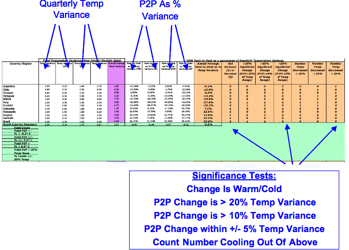
Anyway, now let me explain how I derived (by eye – ugh!) the two primary pieces of data I used to test my hypothesis that the 2000’s are not significantly warmer or cooler than the pre 1960 period (when CO2 levels were drastically lower). Here is how I measured the Peak-to-Peak change in each of the graphs (click to enlarge):
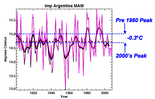
I simply find the highest pre-1960’s peak and the highest point in the 2000’s and subtract. I know this is subjective and error prone, but it is good enough for a ‘reasonableness test’. I would have preferred to use actual data and define min/max points for each time period and compare.
Note I am using the 2005 trend line. I have noticed many graphs where the 2008 would given my hypothesis more strength, and maybe some day I will compute that version. I also know there were higher peaks prior to 2000 (especially around 1998). In fact I found myself averaging the slide from 1998 into the 2000′ many times. I tried to err on the alarmists’ side (my hypothesis to prove after all). Also please note that the ‘raw’ yearly data bounces around well beyond all trend line peaks – so I am not too concerned with fact some peaks are skipped. The next calculation will better explain why.
The P2P data is captured in my results file as shown (click to enlarge):
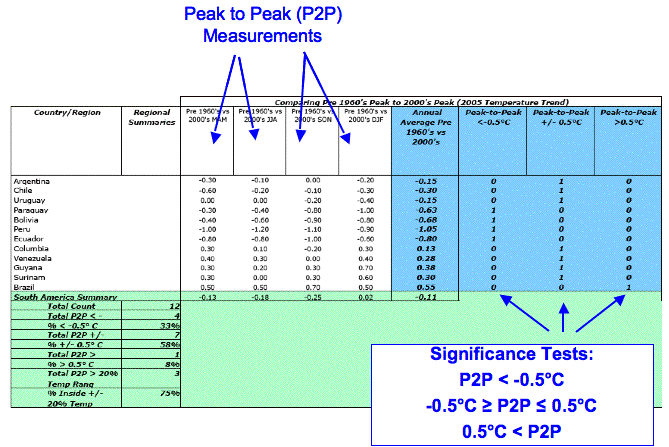
Note: I am trying to find a way to get a clean spreadsheet up so folks can copy out the data.
Anyway, what I did was compute the P2P value for each quarter for each country, and then averaged those over the full ‘year’. Then I applied three significance tests to see if the P2P value is (1) less than -0.5°C, (2) within the +/- range of 0.5°C or (3) greater than +0.5°C. Test (2) tells me the two peaks are highly likely to be statistically insignificant given the confidence levels for any given year (+/- 1°C, per CRU error report). (1) tells me the difference in peaks could represent significant cooling, while (3) tells me the difference could represent significant warming.
I decided used this significance test because of another file dumped with the CRU data which clearly showed where CRU stated its measurement accuracy was typically +/- 1°C or greater. Here is the CRU report from 2005 containing their accuracy claims, along with their own global graph of temperature accuracy:
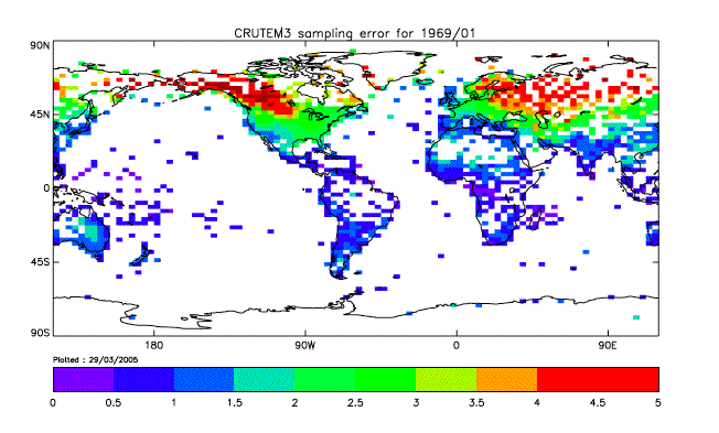
In my original post on these files I went into great detail on the aspect of measurement accuracy (or error bars) regarding alarmists claims. I will not repeat that information here, but I feel I am being generous giving the data a +/- 0.5°C margin of error on a trend line (which itself contains multiple layers of averaging error incorporated in it). Most of the CRU uncertainty data, as mapped on the globe, is above the 1°C uncertainty level.
What this all really means is detecting a global warming increment of 0.8°C is not statistically possible. If I had used their error numbers none of the raw temps would have been significant, which is why people do these back-of-the-envelope tests to determine if we have sufficiently accurate data to test our the hypothesis or not.
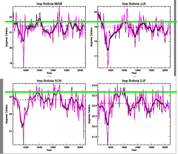
When I was capturing the data and looking at the graphs I realized a change in trend line could be 2° in magnitude and really not be significant if the total range of temperature fluctuations was 10°C or more. I realized the trend line had to move significantly to indicate something outside the noise of the ‘raw’ data. So I decided to capture the natural variability in the measurements, which is conveniently illustrated on the graph’s y-axis (click to enlarge):
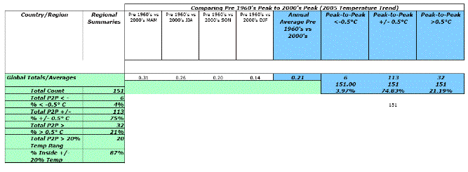
Once I had the natural range of temps measured. I computed the P2P difference as a percent of that range (by quarter), then I averaged this over the “year”. I could not use 50% as the significance threshold (my opinion of a significant change) without again showing there has been no measured temperature changes outside the normal variability. So I tested 10% and 20% (note, there is an error in the chart below, the 3rd test is +/- 10% test, not 5%). You can see how the results of these tests in the full results depicted the following diagram (click to enlarge):
I decided to go with the 20% threshold because the others just seemed too small, too far in the noise (after all I am comparing a trend line measurement to the full range of raw data). This means a decided a P2P change measured in a range of 10°C had be greater than 2°C to be significant, which still seems ridiculously low to me.
Finally I counted how many country’s saw a cooling trend, which seems to be the case in South America. I also computed the number of warming trends per the 3 thresholds. So even when we see a number of P2P’s passing the 20% significance test, some of these can be warm, others cool.
OK, what did I find. 3rd time for the full results link, but here is a snap of the global totals based on P2P and my first significance test (click to enlarge – need to blow these up more!):
Here are some take-aways:
- 4% (16 of the total) countries had significant cooling
- 21% (32 of the total) countries had significant warming (hardly worthy of the cries of pending planetary doom).
- 75% of the countries were within what I would call normal fluctuations, and definitely within the accuracy claimed by CRU.
I have captured this level of P2P detail for each region and it shows how most of the Earth is not significantly different today than from over half a century ago. The regional data also shows how warming is very isolated to sub-regions and latitudes.
Here the global results for the 2nd significance test (P2P as percent of normal temp variance):

As stated this test indicates very few countries show a significant temperature change:
- Using the 20% threshold, 13.25% show significant change, 86.75% fall into the ‘normal’ range
- Even with a 10% threshold the numbers are not showing a global problem (56% normal, 38% significant warming, 6% significant cooling)
Here are some observations in addition to these broader results:
- The Pacific data is pretty bad and has undergone some serious corrections between 2005 and 2008 (showing a lot less warming and more cooling).
- In the far southern latitudes of South America and the Far Norther Regions of Russia the trend is for cooling, sometimes significant cooling. This indicates to me the warming is tied to solar incidence angle, not CO2.
- The fact the closer to the equator the more pronounced the warming is also a sign the warming does not look robe CO2 driven, but solar driven.
- In Europe, the MAM-JJA timeframe (when the Sun is “above” the equator) the warming is very pronounced, but the same regions show no significant warming when the Sun is below the equator – again indicating a solar forcing.
- The vast majority of the trends are on the warming side, but very few are significant
- 75% of the changes are inside the +/- 0.5°C range
- 87% of the changes fail to break the 20% significance test
- What worries me is the CRU mean lines, which I did chart and which show a significant cooling trend from 2005 and 2008. I wonder if CRU uses this useless metric at all (which you can see obliterating all local data as they run flatlined through the graphs). They look very suspicious (so I did not explore them much at this stage).
- Be wary of scales on the graphs, they can run from 2° increments to 0.2°
- If you look at data with very tight temperature ranges (e.g., Malaysia) then you wonder how there could be any global warming cries as these places remain well within their range of 1-2° over the entire 100+ year record. One would think runaway warming would move these very stables areas the most – since warming would be harder to detect in regions with much more variability.
- There are some wild outliers (e.g., Iran) which should be dumped from the set (as I did with the Cook Islands).
- Where I do see warming it is regional and effecting a few countries, not an entire continent.
I think this envelope-level analysis indicates serious problems with the CRU, GISS, NCDC and IPCC claims. The only way to make data that looks like this:
Into something that looks like this:
Is to apply some questionable ‘processing’ steps. The fact is the raw 2008 CRU3 data does not look anything like the alarmists’ processed results. The data, as I have discovered, does not show huge shifts in peak temperatures.
I would have liked to done a better analysis (e.g., sampling the top ten max and min peaks in the yearly data to get a more precise ‘normal range’ for temps, testing multiple periods, etc), but we can understand why the alarmists at CRU were resistant to hand over the raw data. This already looks bleak for them.
BTW, I should not that the current cooling may very well be transient. It may require a combination of solar influx and GHG levels to induce feedback – but this data does not support that hypothesis. This data shows a much more dynamic envelope of ‘normal’, and only minor changes in trends when mapped against this ‘normal range’.
Update: Once your done here, check out this post at WUWT on the MWP – outstanding!
Update: Now CRU agrees to provide all their data! Ugh!!! BTW, I am sure the data exists with Mann and Hanson (GISS). I doubt they could do their work without some of the raw data.


[…] of dealing with the fact that raw temperature data shows little to no warming (see here for starters and see here for much more) and the historical record is sparse and full of […]
[…] Similarly for the weather station record. […]
In the 19th century during the industrial revolution, the public policy was to achieve global warming. I don’t see a problem, they seem to have succeeded to a degree or two, but not much.
[…] specifically this file of seasonal mean temperatures from all over the globe. I used this data in this post where I analyzed the graphs to determine if the measured temperature change (quarterly average by […]
[…] http://strata-sphere.com/blog/index.php/archives/11582 {Data does not even show warming for the 20th century – definitely not significant warming} […]