Dec 19 2009
The Main Reasons AGW Is Pure Science Fiction
One of the interesting things about Climategate is how it has really exposed the pathetic math behind the hypothesis of man-made global warming. Sadly, a lot of us assumed the PhD proponents of global warming were performing sound science based on solid mathematics and statistics. But as more and more professional eyes have reviewed the assumptions and calculations behind the AGW hypothesis, the more it is becoming clear AGW is actually science fiction, not science fact.
To summarize: there are numerous egregious mistakes being made in the calculation of a global temperature index, mistakes in the extension of the current index back in time using older (less accurate) records and proxies, and downright misleading displays of information which hide the reality of global climate behind the science fiction of AGW.
I am going to attempt outline the key evidence that now exists that shows AGW is fiction, not fact. This will not be short.
The Creation of Fictional Temperature Data (or we might as well be measuring temps on planet Vulcan):
There are some truly bizarre ‘adjustments’ made to the planet’s raw temperature data and being sold as ‘established science’. One of the most insane and unprofessional is the ‘homogenizing’ and ‘combining’ of temperature records. There is no need to do this, and in fact there are endless reasons why you don’t do this. Temperature records are temperature records. If stations move, are upgraded, closed down or started up these are all simply independent sets of data. Changing this reality is creating fiction.
For example, here are some very important graphs from New Zealand. The first graph shows three stations and their raw measurements over the last century. This is the reality of the temperature on planet earth at these locations as best we know it:
This 2nd graph is pure fiction, but it represents the mathematical garbage being peddled as proof of man-made global warming:
What the so called ‘scientists’ did here is a crime against mathematics and science. Just as like the interesting fictional warp drive and and transporters of Star Trek, this second chart violates numerous laws of physics and science. It is not real data. It might as well be a measurement of temps on planet Vulcan.
For those who are not well versed in integrating graphs in your head, here is an overlay of these two graphs which highlights the crime:
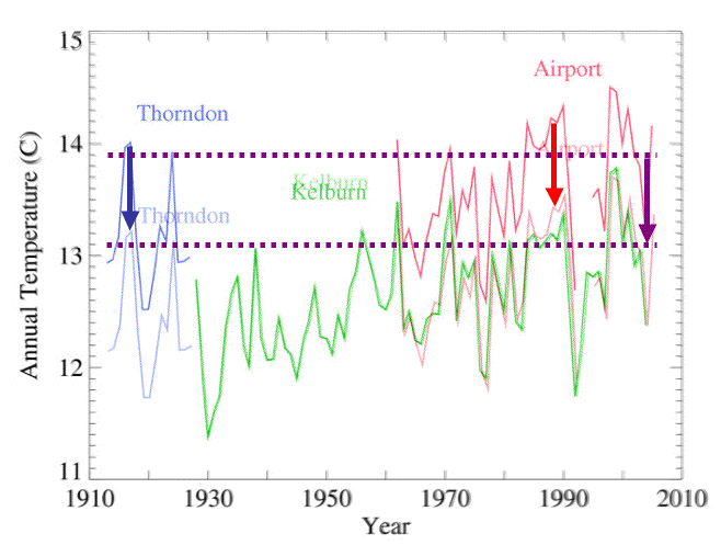
What we see in this picture is where the alarmists cooled off the very warm period measured at Thorndon prior to 1930 (which is equivalent to today’s temperature at Airport). They also cooled off the measurements made at the Airport from 1960 to now. I have noted these ‘adjustments’ by blue and red arrows, respectfully.
This is not averaging or any proper statistical methodology – this is simply creating fiction. You can see how Thorndon and the Airport both showed roughly the same climate (top purple dashed line), but were dropped by about 1°C when ‘adjusted’ by alarmists. There never was a 1°C drop at Thorndon or Airport, thus this is science fiction.
The fact is the Airport and Kelburn data for the period 1960 onward is the only data that could be integrated, since they overlapped in time. All the rest is mathematically off limits unless it is being integrated into a regional or national index for that time period. There is no scientifically defendable reason to adjust the Airport data or Thorndon – none! What these so called scientists did was adjust the Thorndon and Airport data to appear as if they were being measured from Kelburn.
To demonstrate how truly idiotic this kind of adjustment is let’s use the same ‘methodology’ to measure the Moon’s orbit from these 3 locations (something I alluded to in this post). We are going to take a measurement of the Moon’s position from all three sites (as shown in Panel 1 below). All measurements are assumed to be made on the same day at the same time to remove any temporal errors (or uncertainty) between the three measurements.
Then in Panel 2 we ‘adjust’ Thorndon (#1) and Airport (#3) to appear as if we measured the Moon from Kelburn (#2):
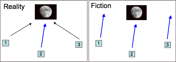
The blue arrow is the vector to the Moon (on a certain day at a certain time) from Kelburn. When we pretend the same measurement is valid for Airport and Thorndon we get two wrong answers overwriting two good data points. This is clearly not a wise approach to measuring the Moon’s actual position and deriving an orbit. It make no less sense in deriving a global temperature.
By doing this kind of ‘adjustment’ we could just as easily say this temperature estimate is from planet Vulcan instead of planet Earth – both claims would be equally valid.
Worse than this station ‘combining’ is when the alarmists create measurements out of thin air. They declare a temperature value is valid for 750 kilometers (450 miles). This is insane, as anyone can see by looking at their regional temperatures in a 20 mile radius on any given day. Temperature accuracies degrade with distance from the measurement, probably by +/- 2°C or more when you go out 50 miles.
Fictional steadiness in temperature over distance is bad enough, but then the AGW PhDs create mythical stations where none exist in enormous grids – creating a fictional world of temperature values which I suspect equal the number of real values, and may even out number the real temperature measurements. This adds even more error/uncertainty to the global index, which at this point is more science fiction (estimation) than real numbers.
I have yet to even come up with a good analogy for creating so much fictional data and calling it reality.
Unspecified Uncertainty and Accuracy (or pretending a 1960’s polaroid camera is as good as today’s 10 megapixel Nicon digital camera)
As William Briggs pointed out in a fine series of posts (culminating in this summary post) properly reporting estimation (or prediction) error/uncertainty is mandatory for real scientists. What the AGW supporters have been doing for years is reporting the completely meaningless statistical ‘parameter errors’, and pretending this is their accuracy.
But the fact is each time you make an adjustment (as we saw above), or create mythical data, or even integrate daily sensor readings into monthly averages for countries or the globe, you are ‘estimating’. And your estimates have prediction errors in them well beyond the measurement error and the statistical parameter error (the other sources of error).
William Briggs illustrated this very will in the following diagram:

Here we see parametric error/uncertainty and assumption/prediction/estimation error. In his example he assumed Station B to have a continuous temperature record (0-80 years). He assumed Station A only had a recent temperature record (50-80 years). He rightfully notes you cannot create any real temperature data for Station A prior to the time it took measurements (as we saw the alarmists do in the above example).
But if you were going to estimate what Station A data might look like for the earlier period – assuming it follows Station B’s temperatures (which better be damn close in distance) – then you have to identify the source and scope of error. BTW, creating a record for Station A prior to it coming on line is the same as creating a station out of thin air using nearby stations.
The darker error band covering the data for Station A from 0-50 years is the parametric error introduced by the statistical equations. But that is not all the error, just the minimal error. There is a lot of ‘prediction/assumption’ error which has to cover the data estimates produced (because these are, after all estimates and the error has to include the estimated temperatures produced! This estimate or predictive error is represented in the lighter color band for the period 0-50 years.
Briggs goes on to show how these two (of three) sources of error also must be played forward into any future predictions of AGW (the blue zones).
As we repeat this insanity for additional stations C, D, CCC, DDD, ZZZZZ (which goes up to many thousands of data points in the warming ‘calculations’) we have to add up all these estimation errors as they impart more and more uncertainty into the final number. We never see this in the AGW numbers, but I can show you what it should look like – even while being extremely conservative.
If we look across time (the 120 years of the measured global temperature record) and across the globe two conditions increase the errors in the global index. One is the accuracy of the measurements themselves and the other is the number of measurements available. It is no surprise that the technology of the 1880’s cannot match the accuracy of today’s measurement systems, and it is not a surprise the early record was not really global. But somehow the earliest, crudest, sparsest measurements are always treated as the most accurate!
Truly fictional.
It is a fact that there were very few places making regular temperature measurements back in 1880 (and in the 1940’s and 1950’s, etc). Here are two graphs from a post which illustrate this phenomena. The first is the number of Norther Hemisphere stations covering the historical record:

There weren’t a lot of stations prior to 1950, were there? All the ‘global temperatures’ prior to this time are very uncertain because there are so few data points. The second graph illustrates this by showing how the station number effects the error/uncertainty in any global calculation:

As we have fewer stations in the early record we have less confidence in the global index these stations are used to create. We get this kind of reversed tuba shape in the error/uncertainty space. As we move forward in time the number of stations increase, reducing the uncertainty.
What this graphs tells us is the actual global temperature index is somewhere in those error bars – no one value can be called the actual value. This in turn means today’s temperatures are not significantly warmer or cooler than when the temp record began given the uncertainty range. This is a mathematical fact, any claims otherwise are fiction.
BTW, this same curve should be duplicated and added twice into the final global indices to address the degradation in sensor and timing accuracy as we go back into time. In essence double these boundaries since we have two sources of uncertainty which behave the same way: (1) number of stations and (2) the antiquated sensors.
One of my favorite CRU documents leaked is a preliminary report on the global temperature index. This is the alarmists’ own estimation of their uncertainty/error. For January 1969 they produced the following graph, which is probably representative for the entire year of 1969 (or even the two decades prior since 1969 predates satellite sensors, the GPS system for accurate time tagging, digital sensor systems, etc.).
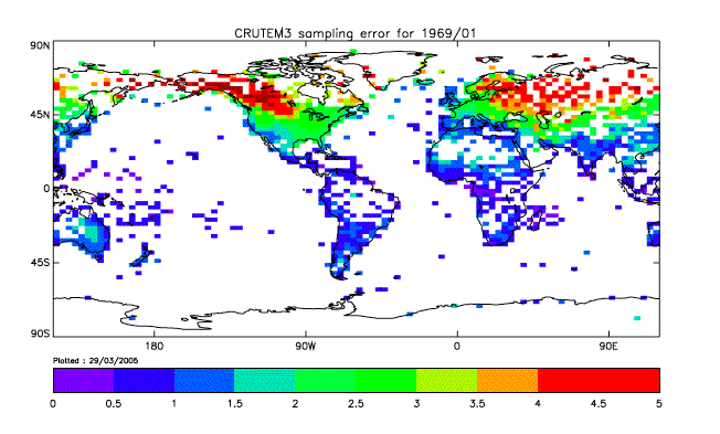
What this graph shows is the best accuracy achievable for any global index in the year 1969 for much of the world is much more than +/- 1 °C. There are significant errors/uncertainty in some areas that rise to 2-3°C and beyond.
But let’s be kind to these poor AGW souls and assume the aggregate global temperature error for 1969 is 1.25°C. This not parametric error/uncertainty alone. This is estimation/predictive error plus parametric error plus measurement error – and in my opinion way too generous. But it matters not because this extremely optimistic uncertainty level completely destroys the AGW theory.
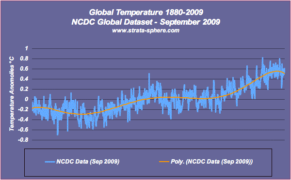
Here is a classic AGW graph from the NCDC showing the global temperature trend. It has their parametric error bars sitting at +/- 0.05°C for the current time period and growing to +/- 0.15°C as we go back to 1880:

Looks pretty scary eh? It completely ignores the measurement and estimation errors as covered in the CRU report leaked last month. Here is the same data with a 6th order polynomial (what I can get out of Excel without a lot of work) so we can compare apples to apples:
But now let me put on error bars of 1.25°C as a very, very conservative measure of the uncertainty according to the CRU assessment of their 1969 data:
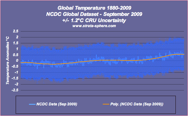
Wow, now it is not all that scary. Actually looks sort of benign – which is why you will never see this view of the science. No drama.
The error bars really should look like a reverse tuba, as we saw with the uncertainty we produced as we went back in time and reduce the number of stations. But the point is still the same. That 0.8°C warming that the Chicken Littles are screaming shows the end of the world coming is well inside the error bars. And that is the CRU error bars! The data shows nothing of interest.
Mixing Data To Create A False Image (or ‘Look, its magic!”)
Instead of dealing with the fact that raw temperature data shows little to no warming (see here for starters and see here for much more) and the historical record is sparse and full of uncertainty, the AGW supporters apparently decided to hide all these inconvenient truths and play a little misinformation and misdirection. They went from science to ‘magic’ (and I mean the art of deception employed by professional magicians).
The first magic ‘trick’ used was adding raw sensor data to statistical proxy models to create that magical hockey stick. This was uncovered by the venerable Steve McIntyre, which I illustrated in two summary graphs.
The first graph showed Mann’s initial try at his ‘Nature trick’ for hiding the decline in temperature behind all those ‘adjusted’ temperature measurements:
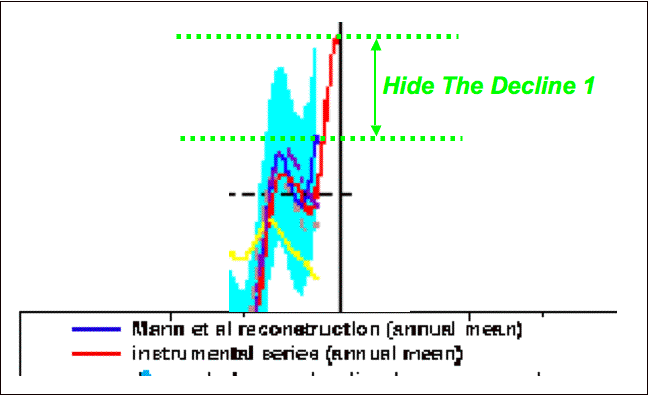
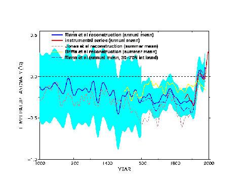
As you can see the statistical models (blue) stopped short of anything scary. But the ‘adjusted’ instrument data (red) keeps climbing making it appear current temps are much higher than much of the prior record (all guesstimate of course). Here is the full original picture:
See how that little red tail is peaking up there?  The IPCC said this was not dramatic enough, so Mann and CRU went back and extended that red line even higher, as we see in the second chart below. To do this these PhDs had to increase the height of the chart by 0.5°C to cover this new and improved red line.
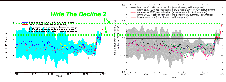
Before the correction the red tail did not rise beyond the historical error bars (the blue or gray area behind the lines in each chart). But after some more ‘adjustments it reached up high enough to become truly historically significant.
The problem is that red line has no mathematical business being in that chart at all. None. It is a con, a misdirection, a trick of the eye. It is mixing two different sets of data and giving the impression they should be on the same graph.
Just like this data is a trick of the eye, where we see the raw station data from northern Australia basically flat lining while the ‘adjusted’ data climbs into the sky of pending doom.
(More of the same here, here and here). That stepping black line shows a completely unnatural ‘adjustment’ being made to the raw (blue) data. This is not a natural process – this fudging data. The red line is a fiction created by adding the black data to the real blue data.
This is no surprise really to many who followed this story for a while. It has long been shown that the time period with the highest accuracy (post 1960) has seen the most ‘corrections’. This makes no scientific sense of course, but then it is not done for science.
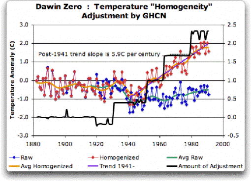
Just like the graph above, we see the modern data being heavily ‘adjusted’ everywhere we look – even though this period has the most stations world wide and the utilizes the latest technology base. These ‘adjustments’ have been hiding in plain site for months and years – where no one challenged the cult-think behind AGW. Check out this graph that I have used many times in discussing global warming shenanigans:

It is from the National Oceanographic and Atmospheric Administration, or NOAA. It unabashedly illustrates how raw UHCN data has been ‘adjusted’ in ever increasing steps to create 0.6°C of warming beyond the raw measurement data. Why? Who knows!
The fact is the alarmists have used many, many ways to hide the decline, including the use of tree rings to overwrite the much more accurate ice core data. There is also the trick of collapsing time so that people don’t see the fact CO2 changes have lagged temperature changes by 800 years, not driven them! If there is a way to mislead, the alarmists have found it.
The alarmist keep producing more varieties of misleading graphs, praying no one will notice they are actually magicians versed in the art of deception – not really scientists. This is why AGW is pure science fiction and not established fact. The data they won’t show you, the methods they won’t defend, the error/uncertainty analysis they never produce is all part of the fiction of man-made global warming.


AJ,
I was told to contact you for help with this. I am currently trying to find out more information on this:
In Lord Monckton’s letter to Dr. Pachauri he unscientifically demonstrated that the slopes for the previous periods of warming were similar to the slope of the warming period we are currently in (page 6 in the PDF linked below.)
http://scienceandpublicpolicy.org/images/stories/papers/originals/pachauri_letter.pdf
However I’m having trouble finding data or studies that demonstrate the warming is occurring at the same rate as earlier in the century.
This is where I am going with this:
The scientific literature says that our current warming (last 30-35)
years is too great to be caused by the sun alone. They attribute it
of course to anthropogenic causes. They wholly attribute the
1850-1975/1980 warming we have seen to natural causes. It sure seems that if our current warming is at a rate no greater than the previous warming that it could be caused by the same natural mechanisms.
Do you have any data or statistics that show that our recent warming (1980 – 2000ish) occurred at a rate greater than that of the other two warming periods since 1850?
(I plotted something similar to Lord Monckton’s data here:
http://www.woodfortrees.org/graph/hadcrut3vgl/from:1910/to:1940/trend/plot/hadcrut3vgl/from:1850/to:2010/plot/hadcrut3vgl/from:1860/to:1880/trend/plot/hadcrut3vgl/from:1980/to:2010/trend
)
Hi –
The figure plotting (Raw-Adjusted USHCN Temp) vs. Time very compelling. Am assuming you constructed it. If yes, where did you get the numbers? If no, whence the figure.
Appreciate the courtesy – TA
This is a well timed post. I dropped by because I found this powerpoint presentation: A Theory for Estimating Uncertainties in the Assessment of Global and Regional Surface Air Temperature Changes.
http://www.math.sdsu.edu/AMS_SIAM08Shen/Shen.pdf
It seems to be an explanation of how they estimate or propose to estimate uncertainty for their calculations of regional and global temperatures. If that’s the case, doesn’t it represent how they view the margin of error in the steps beyond the file you found in the Climategate hack? It has a similar chart. Sort of a complete set?
Don’t know if it will help, but I was surprised to see it and thought it might. No, the error bars around the trend line aren’t any wider in this than what you calculated with the 6th order polynomial.
You proved me wrong.
Here I thought that the “climate science” community had been overtaken by refugees from the Tobacco Institute (a PhD statistician once described it his “dream job”), but now it seems when it comes to statistics, these guy are poseurs.
These “climate scientists” give “amateur hour” a bad name.
T.A.,
No I did not create the graph. As I said, it was created by NOAA!
bobbyb,
They may have wanted you to look at this post, where selecting the period in question dictates the slope you see in the analysis
I guess I just don’t understand the problem.
Al Gore flies anywhere he desires by private jet, lives in a house that consumes more electricity than the city I live in, but he’s not a problem to the world because he buys a carbon offset for each unit of CO2 he produces. Of course he buys it from himself, so it is very inexpensive.
So to solve the problem for the whole world I suggest you calculate how many tons of CO2 you produce each year, then buy an offset, from yourself of course, for that amount. You can charge any amount you wish for the offset because you are paying it to yourself so you’ll always be able to afford it.
Just to show my spirit of cooperation, I went ahead and bought several extra tons of credit. I paid myself $5.00 per ton, so while it cost me $40, I also made $40.
As soon as everyone gets their program going there will not be a problem any longer.
This is just how silly the climate changers are.
Of course all this is total BS, the same as AGW.
sarc off.
[…] This post was mentioned on Twitter by Malcolm Bell, AJ Strata. AJ Strata said: new: The Main Reasons AGW Is Pure Science Fiction http://strata-sphere.com/blog/index.php/archives/11932 […]
The January 1969 estimate of errors always struck me as bizarre. How do you get errors in the third world of South America, India, and Africa to be half the errors of the US?
Excellent analysis – as all the other you have published on your blog.
The damage done to science by these people is unimaginable – it goes much further than just climate and the data they’ve manipulated.
But without having these manipulations made public, for all to see, our debates with AGW believers will always end in mud-slinging.
Therefore, thanks for all the sterling work you’ve done over the last weeks!
Whether the earth has warmed over any given period of time is separate from the issue of whether humans are responsible for a significant part of it. So I think you really do need to separate the quality of the data and its manipulation from the Anthropogenic Global Warming hypothesis. Conflating them as you do in the headline and by constantly referencing AGW in posts about data quality seems to help the ‘climate change consensus’ to avoid the issue.
[…] speaking of Strata, here he explains why he sees [strong] AGW is pure science fiction. We link, you […]
[…] The pathetic math behind the hypothesis of man-made global warming. […]
I recently came upon an article which seem to explain how the main line climate scientists have gotten world opinion to believed them in regard to man made global warming and the effect of green house gases.
In the January 2010 Wired Magazine an article by Johah Lehrer tells of the work of Dr. Kevin Dunbar, Director of the Laboratory for Complex Thinking and Reasoning at the University of Toronto Scarborough. Lehrer says “Kevin Dunbar is a researcher who studies how scientists study things – how they fail and succeed.†Dr. Dunbar is quoted as saying “The scientists had these elaborate theories about what was suppose to happen. But the results kept contradicting their theories.†Lehrer go on to point out when the scientist found data which didn’t follow or prove their theory they tended to ignore it and not look for the reason why it was different. He says “The fact is, we carefully edit our reality, searching for evidence that confirms what we already believe. Although we pretend we’er empiricists – our views dictated by nothing but the facts – we’re actually blinkered, especially when it comes to information that contradicts our theories.â€
For me, this is very clearly what has happened with the climate scientists who have given us the man made global warming theories and reported them as fact. It has happened too many times in the history of science. Dr. Dunbar points out that the only way to avoid this failure to really understand what is going on is to have outsiders reviewing the research and offering their ideas and opinions. We need to get on with a formal review before our Congress destroys our economy in the name of protecting the planet.
Little do they know that in their analytical models that they have erased decades, centuries, of science, geology, topography, insect migration, etc…. that have shown “otherwise”. And yet…no statements from any of those people who have documented such things..that the science of all this has somehow changed.
This may be a nit pick, but the “pointing at the moon” example you give above is very weak. The moon is almost a point source because of it’s distance.
Light from a point source is planar. For example, if everyone on earth who could see the sun simultaneously pointed at it (or the center of the sun to be technical), all the arms would be parallel.
buzgz,
I work for NASA and I can tell you that you cannot compute an orbit correctly by that example. Nit pick all you want, but it would not work (especially if you do the measurements across many years).