Dec 29 2011
More CRU “Fun With Numbers“
I have been inspired by my reading of The Hockey Stick Illusion by A.W. Montford. It has caused me to revisit the Climategate 1 data files as well as the thousands of emails now made public. In doing word searches on files and emails, I sometimes just stumble over stuff that catches my eye and which opens all sorts of questions. That very kind of serendipitous event happened the other day and what I discovered was quite enlightening
I have become much more cognizant of file dates now that I have a better handle on the timeline of events. And I noticed a bunch of data files (under FOIA/documents/osborn-tree3 of the original Climategate 1 directory structure) that were all produced on October 12, 2007. A very interesting time for the Hockey Team, as this was around the time of the IPCC AR4 work. I just had to find out why these were leaked and what they contained!
The data files are:
- reginstr_aprsep_ALL.txt
- reginstr_aprsep_CSU.txt
- reginstr_aprsep_ENA.txt
- reginstr_aprsep_ESU.txt
- reginstr_aprsep_NEUR.txt
- reginstr_aprsep_NORTH.txt [not addressed here]
- reginstr_aprsep_NWNA.txt
- reginstr_aprsep_SEUR.txt
- reginstr_aprsep_SOUTH.txt [not addressed here]
- reginstr_aprsep_SWNA.txt
- eginstr_aprsep_WSU.txt
They show the “Regional-mean CRUTEM1 instrumental temperature for Apr-Sep for region XXX“, where “XXX” is the acronym of the file you see above. This is a direct copy of the comment header in each file. So all these files contain the CRU regional temperature anomalies constructed from the CRU temperature database (CRUTEM1) . They are computed for the regions shown below in a Briffa/CRU diagram (H/T Steve McIntyre). The legend of the diagram is also from McIntyre’s blog site.
Note the 2007 files use “WSU” [assuming here Western Soviet Union?] instead of “WSIB” [Western Siberia], as used by Briffa. The file “ALL” contains the integration of all the data into a Northern Hemisphere record.
Briffa et al. [Nature 1998] Fig 1a. Definition of regions and number of sites: southwestern (SWNA, 53 sites), northwestern (NWNA, 30) and eastern (ENA, 34) North America; northern (NEUR, 46) and southern (SEUR, 72) Europe; western (WSIB, 42), central (CSIB, 31) and eastern (ESIB, 6) Siberia; all 125 sites in SWNA and SEUR form the composite region SOUTH, and all 189 sites in the six northern regions form the NORTH region; ALL is an average of all 314 sites.
Clearly these files were used to correlate tree ring data to regional instrument-based temperatures that represent the modern record. It is by this comparison between rings and temps that tree chronologies/series are ‘calibrated’. If the calibration is suspect, then the comparison of rings from the past (e.g., The Little Ice Age and Medieval Warm Period) are also suspect.
I have long suspected that the CRU processing of temperature data from the local daily values (now supposedly lost to time) to gridded monthly values, and then to regional seasonal values, and finally to global annual values gave the CRU gang many opportunities to introduce adjustments (inadvertently or via deliberate assumptions). Adjustments that could skew the temperature record to one side of the debate. Each step is a point to introduce uncertainty, error and whatever else the math wishes to tease out.
This data gave me an opportunity investigate this theory, and I was not disappointed. The following are graphs of each data files, showing the CRU regional temperature anomaly curves up through 1992 (apparently the end of the CRUTEM1 data set). Note how these results DO NOT look like the normal IPCC temperature diagram, with a constant rising global temperature from the late 1800’s to today, with a small pause around 1940.
Here is a classic IPCC, CRU, NCDC, GISS modern instrument temperature profile from NCDC (click to enlarge):
Keep this in mind while we peruse the 2007 profiles used to correlate the tree rings to the ‘real’ modern record!
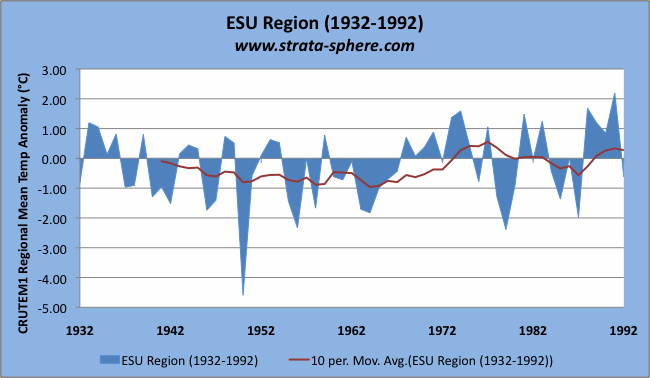
First up, ESU (assuming here Eastern Soviet Union – or Eastern Siberia) – click any graph to enlarge.
This is the shortest of the series, beginning in 1932. The blue area denotes mean temperature anomalies for the April-September period (the season for tree growth), for each year (assumed °C for units). The trend line (brown) is a 10 year running average. While the annual anomaly fluctuates greatly (-4.5° to +2.1° C) the moving 10 year average is pretty benign. It rambles between -1°C and +0.5°C. Also note how today’s temperature is not much different than the 1930’s, 1940’s and 1970’s. The average is -0.23°C with a median of -0.04°C (this will become important in a bit).
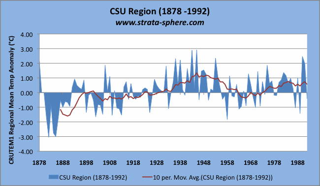
Next up, lets look at CSU (Central Siberia or Soviet Union):
This series is much longer, extending back to 1878. What just jumps out is how the 1930’s and 1940’s were clearly much warmer in this regional summer series than today. The annual season anomalies range from -3° to +3°C, with the 10 year average usually between -1°C and +1°C. The exceptions being an extreme cold period in the 1880’s and the aforementioned warm period in the ’30’s and 40’s. The average was +0.1°C, with a median of +0.11°C. So far we are not seeing the usual IPCC dramatic rise in modern temperature.
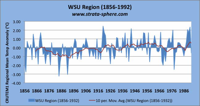
Now onto WSU (assuming Western Siberia/Soviet Union):
Amazing. We now have covered the entire Norther Russia/Siberia region and no dramatic increase in temperature. This series is one of the full length series starting in 1856. It has an annual seasonal anomaly that ranges from -3.1° to +2.4°C. But that 10 year running average pretty much stays between ±0.5°C after 1900. The exception being a cold spell in the 1880’s. The average is -0.1°C, with a median of -0.16°C.
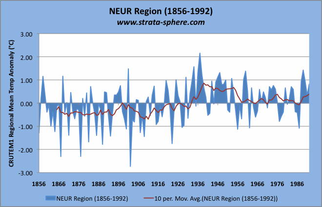
Now let’s move onto North Europe (NEUR):
A pattern is clearly emerging here. We see no ramp up of temperatures from the early 1900’s to today. While the range of seasonal anomalies in this region goes from -2.8° to +2.1°C, the 10 year running average meanders between ±0.9°C. Here again we see that the CRU numbers are indicating a much warmer period in the 1930’s to 1940’s range as opposed to today.
I have noted this many times before (see here and here) regarding how the this period nearly 80 years ago is basically the same as today – and prior to the large increases of atmospheric CO2. For this series the average was -0.02°C, with median of +0.11°C.
Now we are going to get into some data that goes beyond the lack of a ramped up temperature curve. Those averages and means are now going to come into play. Here is the Southern European seasonal mean anomalies from CRU as computed in 2007:
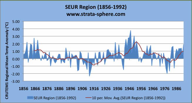
OK, if you are casually glancing (or your eyes are glazing over) you may have missed something very different in this graph verses the others. If I was not working the graph formats I might have easily missed it. The range of seasonal anomalies is -2.2° to +3.9°, which seemed a bit skewed warm. In fact, the entire graph seems to be warm, which is odd since this is a regional anomaly data set – basically looking at this region’s temperature history and supposedly comparing it to itself. So the 10 year average should run pretty much close to the y=0 line (like all the previous ones did).
This data, though, has an average of +0.41°C! That is four times higher than the data/graphs so far. The median is +0.44°C. We still have the modern times cooler than the 1930’s and 1940’s warm spell, and on par with temps in the 1850’s and 1860’s. But this mysterious ‘adjustment’ upward to warmer struck me as odd. So I ‘normalized’ the data around the average (subtracting it from all values) and recomputed.
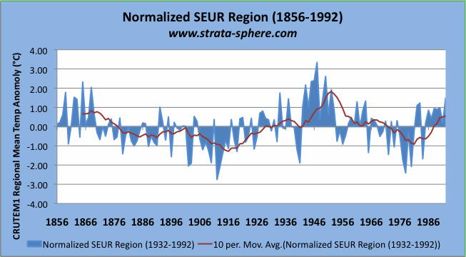
Here is the ‘normalized’ SEUR data:
This new data set has an average of 0.0°C and a median of +0.3°C (basically shifted down by 0.41°C). The range is a much more balanced -2.9° to +3.2°C. This is not the last time we will see such a shift in the regional anomaly data.
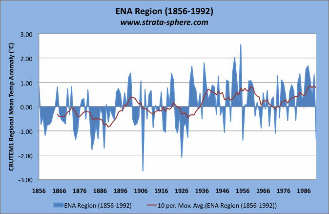
Now onto America! Since we have been moving east to west so far, let’s continue on to Eastern North America (ENA):
This is the last series not to have issues with its average/mean. It also shows again a very flat temperature signature from the 1930’s/1940’s and today. The annual seasonal anomaly fluctuates between -2.7° to 2.6°C. The 10 year average meanders between ±0.9°C. It has an average of +0.07°C and an median value of +0.24°C.
We are now heading into the last stretch with two more series. Remember, these are CRU produced instrument temperatures from CRUTEM1 (something supposedly lost due to lack of file space in the 1980’s). If these are CRU derived values used in 2007, the implications are not good for Phil Jones, CRU or the Hockey Team.
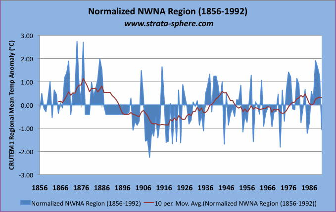
Our next stop is Northwestern North America (NWNA):
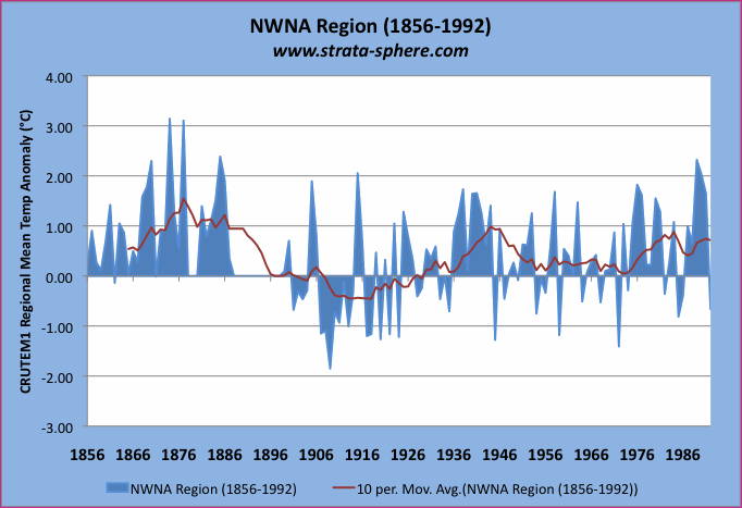
Again we see the strange situation where this region’s instrument record is shifted to the warm side – as if it is not being compared to itself but some arbitrary value of what CRU deems ‘normal’. As is easily seen, the seasonal anomalies spend a majority of their time above zero. The range is shifted to the warm side, with a range spanning -1.95° to +3.05°C. The 10 year average barely spends any time below zero, running from -0.4°C to 1.4°C. Not surprisingly we discover this data series has an average of +0.41°C, and a median of +.28°C.
While this one series has a significant warm period in the late 1800’s (which clearly is beyond what we see today) the fact is it also has a modern day anomaly which is not all that warm when looking at the 10 year average. Not surprisingly today’s temps are on par with the 1930’s and 1940’s.
Note: there is no data from 1879-1880 and 1888-18898 – so the values are set to zero. When I average all sets together later, I do not include these years for this series – only years where there is actual measurement data.
If we do the same adjustment as I did before (subtracting the average from each value and recomputing) the ‘normalized’ data set looks like this:
This data has an average = 0°C with a median of -0.12°C
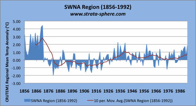
The final data set is for the Southwest North America (SWNA):
Again, this data set seems inconsistent for a regional history since its average and median are not very close to zero. We see this massive warm period in the late 1800’s, followed by a cool spell which ends in the 1930’s and 1940’s. Today’s temperatures in this series are well below the initial warm spell in the late 1880’s and below the next warm spell in the 30’s and 40’s. The average = +0.35°C – 3 times the first series we looked at. It has a median of +0.22°C.
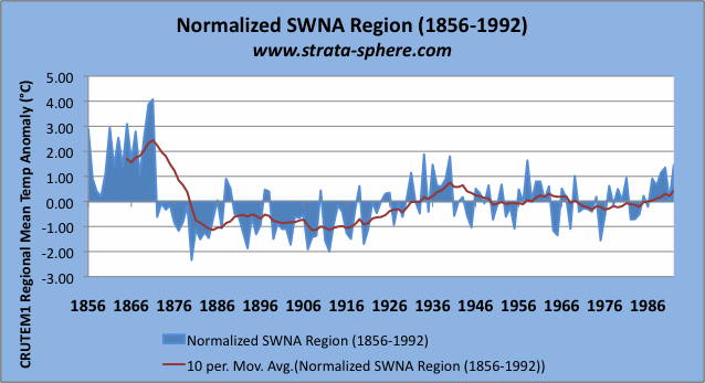
I will do one more normalization calculation on his set and we will be ready for the grand totals:
This ‘normalized’ data has an average of 0°C and a median of -0.13‡°C. Note how this normalized data set has no significant warming past 1946. Interesting how a slight adjustment can ripple throughout a data set.
So, how would a normal person “average” these regional mean anomalies to produce a complete Northern Hemisphere temperature record useful to compare millennium? Well, I have no clue what CRU did, but I took each region’s seasonal anomaly (when there was a value) and averaged it to create a Northern Hemisphere value for the year. Since these are seasonal values (Apr-Sep) over a large region encompassing many grids, stations, days and months, it would seem to me these are all representative delta‘s from year to year for temperature in that region. Nothing beyond averaging seems prudent. They may be to some common reference period (or not), but to me you simply average these already averaged values and you should get the “ALL” results.
Not so. The following is AJStrata’s straight forward averaging of the regional annual anomaly compared to CRU “ALL”:
Strange results, don’t you think? I have added a few more things to this graph to highlight the questionable results. First note how the CRU data (red) seems to fluctuate a lot more than my straightforward average. Why is that? I took the averages of the regional values (when there were values). How could CRU produce more variability? This is true both in the yearly seasonal values (red area) and the 10 year running average (red line).
And look where the linear trend lines end up (dashed lines). The CRU linear trend shows +0.9°C increase over the period, ending with a +0.7°C final value. My simple averaging method shows a +0.5°C increase (almost half the CRU rise), ending at +0.4°C.
I will say it again, how can the variability increase over the regional values when averaging? Must be that new-fangled math.
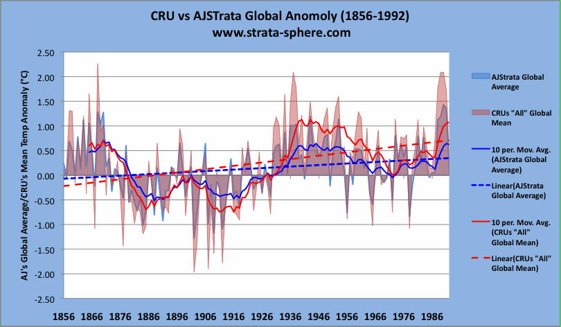
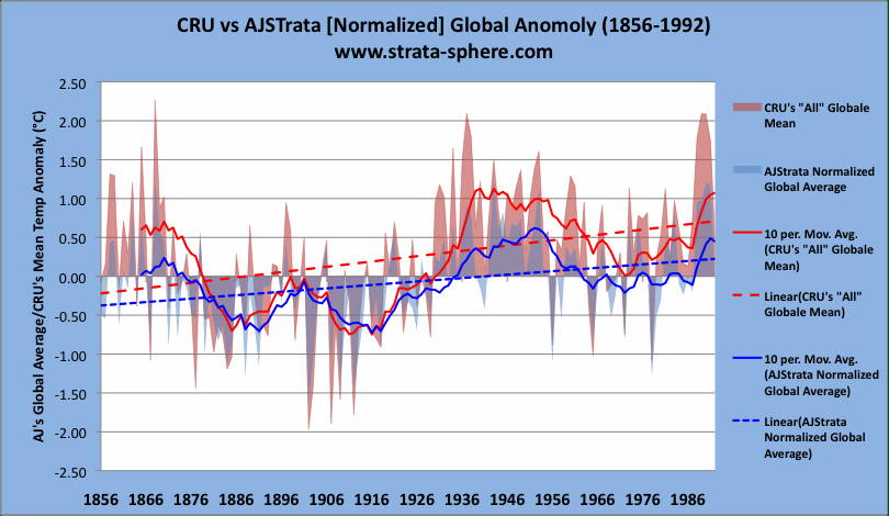
And now let’s consider the three data sets with what seem to be biased anomalies. As I noted I computed “normalized’ versions of these data sets to see what the impact would be. So let’s look at an averaged Northern Hemisphere average using these 3 updated data sets, and compare them to CRU:
Now this is truly interesting. This looks nothing like the NCDC graph I showed at the beginning. And if you notice the normalization has caused the CRU and AJStrata solutions to ‘diverge’ quite a lot. First off, the late 1800’s don’t look nearly as warm in my results. The two solutions look very close up until the 1930-1940 warm spell, where the CRU ‘average’ goes way up. CRU over achieves again when we look at the recent temp record average, running a +0.5°C ahead by the end with the 10 year average line.
The CRU 10 year average ends with a +1.1°C anomaly trend, where my results show a much more benign +0.5°C (a value expected from normal warming coming out of the Little Ice Age). Is this defensible given the regional values? Did someone apply some nifty weighting (basically leaving a stealthy finger on the balance scales)?
I am confounded as to how CRU was able to take averages over regions and increase the variability, and also have three series that are clearly skewed to the warm side (since they are supposed to be regional anomalies compared to the regional ‘norm’). How convenient that both of these mathematical quirks increase the warming of modern day in comparison to yester-years.
Coincidence? How many coincidental mistakes can one group of people have before the probabilities run out?
To recap. This data was computed in 2007, most likely for the IPCC AR4 reports. It is used to calibrate tree rings, so it is probably more accurate than the highly ‘adjusted’ instrument temp records we see published (like the NCDC graph above). It is an intermediate product, and therefore can shed insight into where the data was before final polishing (er, adjustments) was applied.
What does it mean? Not sure, it just smells funky.
I will be posting the raw data as soon as I can make sure the excel sheet is web-proof. Check back for updates




I think they weighted different series differently. Did you weight them all equally? I believe they might weight series according to how large an area they cover.
I also remember how Briffa would “preselect” members of a series based on a calibration period. He would select some period of time and select only the members of set that matched the instrument readings for July temperatures during the calibration period making the assumption that those were the specific trees that made the best “thermometers”.
So he didn’t use all members of a series.
I think.
[…] More CRU “Fun With Numbers“ Like this:LikeBe the first to like this post. […]
Interesting post!
Did you seriously think you could just average these regions irrespective of their area?
Ironically anyone as paranoid and innuendo driven as you would describe your action there as suspicious and wonder if you did it deliberately to hide the warming.
“he range of seasonal anomalies is -2.2° to +3.9°, which seemed a bit skewed warm. In fact, the entire graph seems to be warm, which is odd since this is a regional anomaly data set – basically looking at this region’s temperature history and supposedly comparing it to itself. So the 10 year average should run pretty much close to the y=0 line (like all the previous ones did).”
To anyone competent this would suggest therefore the graphs use a baseline like 1940-1970 rather than the entire thing. In fact your presumption that the graph should use a baseline of the entire period suggests you are ignorant of the common practices of science on this subject.
bonm2 – Yes you CAN just average the regions, since they are already averaged. If I am looking at three sections of the globe, and I want to know average sunlight after I have created average from each section I just average them. Duh.
Don’t over engineer it unless you need to push the statistics to tell you something not there.
And it was a back of the envelope calculation – a benchmark to make sure any ‘fine tuning’ doesn’t get out of control. Which is why there is a legitimate question as to how the globe has a larger variance when averaged (i.e, ‘mean’ their comment documentation, not mine). Implausible.
And it is strange that 3 of the 6 ares skewed, and those 3 shift the ‘all’ averages up. I did show both, so stop your whining.