Dec 08 2009
Another Set Of Cooked AGW Data, Results In More Proof AGW Does Not Exist
WUWT has another example of someone analyzing the raw temperature record verses the ‘adjusted’ data that comes out of the alarmists’ myth generating code. It seems anyone can now dump the raw and ‘adjusted’ temperature data from GIS and start asking some long overdue questions about what the hell these people think they are doing.
That cadre of alarmist ‘scientists’ who thought they were the smartest people on the planet are now running into something the world has yet to fully grasp. The age of the internet and blogs (along with supporting SW tools that do data processing, graphing, video editing, etc) has created the ability for powerful and rapid collaborations of very smart and gifted individuals to form over night. These virtual teams are a new force that humanity’s legacy institutions have never faced before. They are in for a shock.
This is not just a handful of cliquish elites trying to hide the true nature of their ‘tricks’ (and suborn the scientific method and peer review processes). No. This electronic collaboration combines the creativity, insight and skills of hundreds of people who are all driven by an unspoken commitment to find the scientific truth. This virtual ‘team’ works spontaneously, focusing on the latest discovery and then the next, building an electronic record of discovery for all to see. There are some members more gifted in the math and science, others more gifted in communicating, some gifted in finding gems on the internet.
But the most important feature is the synergy that comes out of this. The spontaneous virtual collaboration is powerful when used right (groups always need to avoid becoming a mindless mob chasing a myth or conspiracy theory). But when done right, the application of so much human brain power can unravel a mystery like a tornado strips the land bare in its path. And that is the storm the UN IPCC, CRU, NASA GIS and other institutions are now facing.
So let me play my small part in this electronic peer review and dissection of the AGW theory, and circle back to the fact that the best AGW models we currently have been producing two predicted outputs: One with man-made global warming (AGW) and one without. We see these two predicted outcomes in all these charts (click to enlarge).

The alarming ‘reddish’ regions are what the model say happens if there is significant human impact on the Earth’s climate. The blue regions are what these models predict the temperatures will be if there is no significant human impact on Earth’s climate. The black line is supposedly the observational record of temperature.
But it is not the record of observations. The observational record – the pre ‘adjusted’ record – actually follows the blue region. That black line is the result of fudging the raw data to meet the AGW models’ predictions for man-made warming. You cannot prove a theory by data that has been adjusted to match the theory – that is the classic self licking ice cream cone, and that is a completely invalid test of a hypothesis.
To prove a hypothesis like AGW one must use the raw temperature data.
This graph from the WUWT post above best represents what people are now discovering as they go back and perform due diligence on alarmists’ claims by looking at the pre adjusted, raw data:
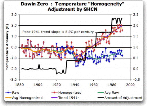
As you can see the actual Darwin, Australia station temperature record (in blue, coincidentally) diverges from the ‘adjusted’ GISS data (in red). Without the adjustments there is no rampant warming in this part of Australia. The analyst had this to say when he discovered the inconsistency:
Yikes again, double yikes! What on earth justifies that adjustment? How can they do that? We have five different records covering Darwin from 1941 on. They all agree almost exactly. Why adjust them at all? They’ve just added a huge artificial totally imaginary trend to the last half of the raw data! Now it looks like the IPCC diagram in Figure 1, all right … but a six degree per century trend? And in the shape of a regular stepped pyramid climbing to heaven? What’s up with that?
Those, dear friends, are the clumsy fingerprints of someone messing with the data Egyptian style … they are indisputable evidence that the “homogenized†data has been changed to fit someone’s preconceptions about whether the earth is warming.
One thing is clear from this. People who say that “Climategate was only about scientists behaving badly, but the data is OK†are wrong. At least one part of the data is bad, too. The Smoking Gun for that statement is at Darwin Zero.
Agreed. But the analyst also asks a very reasonable question as to why would anyone do this to the raw temp data. The answer is because the IPCC and others predicted that what would happen under man-made global warming using their vaunted models, and these alarmists need to make sure that the temperature record shows the right prediction!
Here is one of the accompanying graphs (the ‘Figure 1’ referenced in the quote) showing the AGW predictions for northern Australia. The red band again is if there is man-made global warming, the blue band is if there is no man-made global warming.
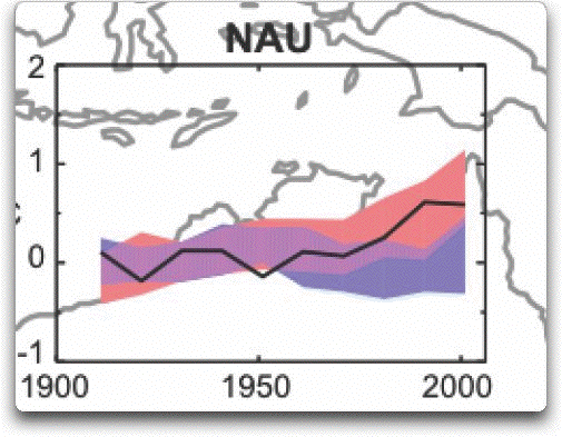
Note how the two bands overlap until 1960 or so? Now here is the Darwin Station analysis overlaid on the AGW model predictions:
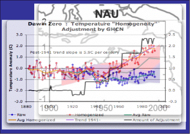
I cannot get the scales to match (this is a station verses the northern half of a continent), but the dates line up. It’s as clear as crystal why alarmists need to make such drastic (and unproven) adjustments. If they don’t their own AGW models will prove their AGW myths to be busted! [BTW, NASA GIS is also under a FOIA request for their algorithms on how they ‘adjust’ reality, which they have been trying to avoid for 3 years now]
I noted this very trend myself in South America using CRU pre ‘adjusted’ data made public in the recent data dump. The CRU pre ‘adjusted’ data followed the blue region, thereby proving via the AGW models there is no man-made global warming. And we saw this before in another analysis from New Zealand (here and here).
GISS, sadly for them, has provided both the pre and post adjusted data as the Darwin Station analysis shows. Which means a legion of bloggers will be now performing the same analysis and asking the very same questions.


[…] This post was mentioned on Twitter by Whotnaught, AJ Strata. AJ Strata said: new: Another Set Of Cooked AGW Data, Results In More Proof AGW Does Not Exist http://strata-sphere.com/blog/index.php/archives/11787 […]
[…] his dismay that folks are noticing the bumps under the rug. AJ Strata takes note of this in Another Set Of Cooked AGW Data, Results In More Proof AGW Does Not Exist That cadre of alarmist ’scientists’ who thought they were the smartest people on the planet are […]
[…] his dismay that folks are noticing the bumps under the rug. AJ Strata takes note of this in Another Set Of Cooked AGW Data, Results In More Proof AGW Does Not Exist That cadre of alarmist ’scientists’ who thought they were the smartest people on the planet are […]
AJ,
I’m looking at some data from GISS. Basically the “raw” data vs homogenized data.
At one station, West Point NY, the raw data averaged yearly, shows no warming trend.
Yet the homogenized data shows a definite warming trend post 1980.
Seems, as the Watt’s Up With That? article notes, the homogenization process depresses the early data, while leaving the more recent data untouched.
As a result, a hockey stick graph is created by simply depressing pre-1980 temps.
I created a crappy graph to make the point: http://thevirtuousrepublic.com/?p=4813
I bet as I like at more sites, pattern will be repeated.
Bryan
Excellent work grumpy guy – I will post on it later today!
[…] grumpguy went to the NASA GISS site and pulled down data for one station in New York. What he found is no surprise – another example of raw station data being ‘adjusted’ to show recent […]
[…] the hands of those whose careers and credibility rest on AGW being proven to be true. When you do, you get those questionable ‘adjustments’ that turn raw temp data (processed to at least to step 5 in the error budget above) turn into […]